Overview
During my 12-week internship at Adobe as a experience designer, I finished
three projects:
Explored the design of a universal asset
panel for next-gen CC products;
Prototyped the team's latest design in the
context of a new video-editing app;
Carried out an in-depth user
research to validate the design framework.
These three parts of my internship project together contributed to a more consistent and complete design framework for next generation CC products.

↑ Some of the next-gen CC products that I designed for
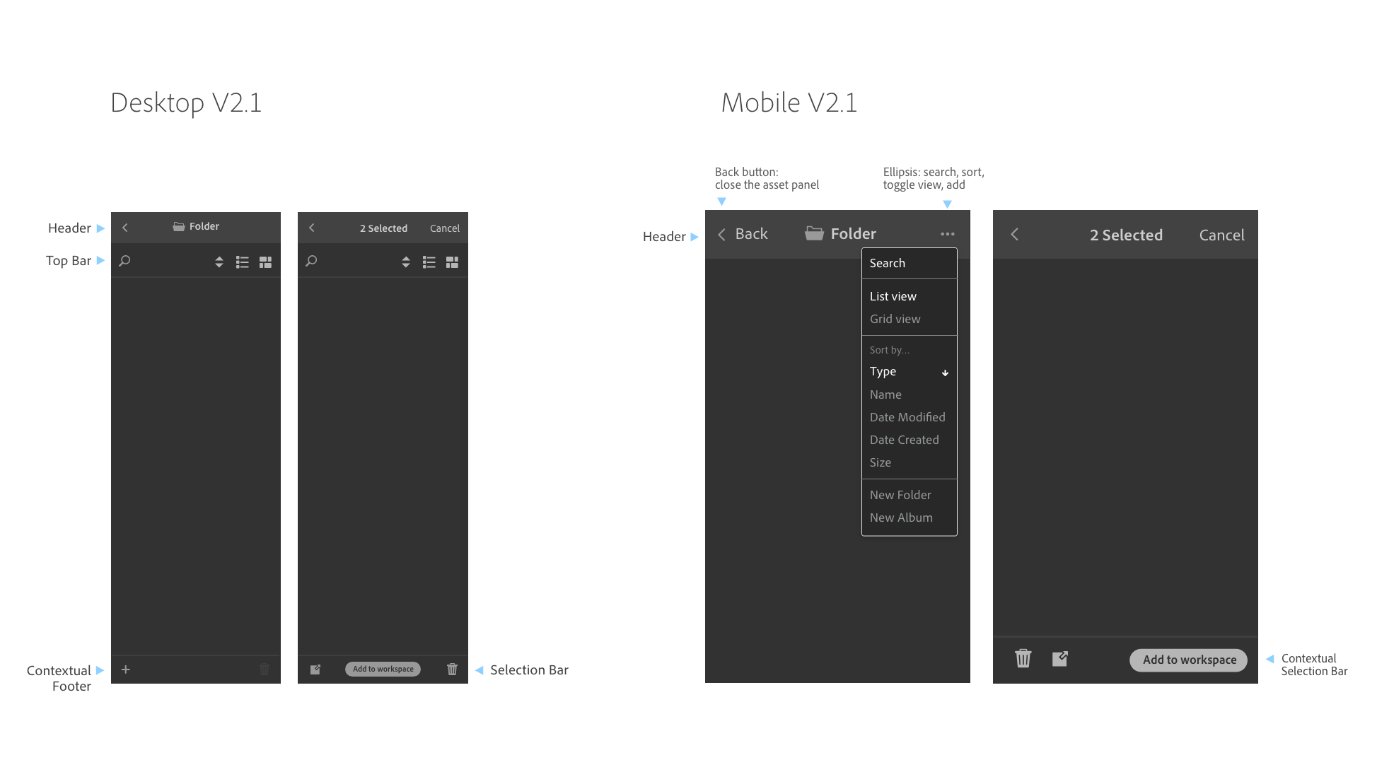
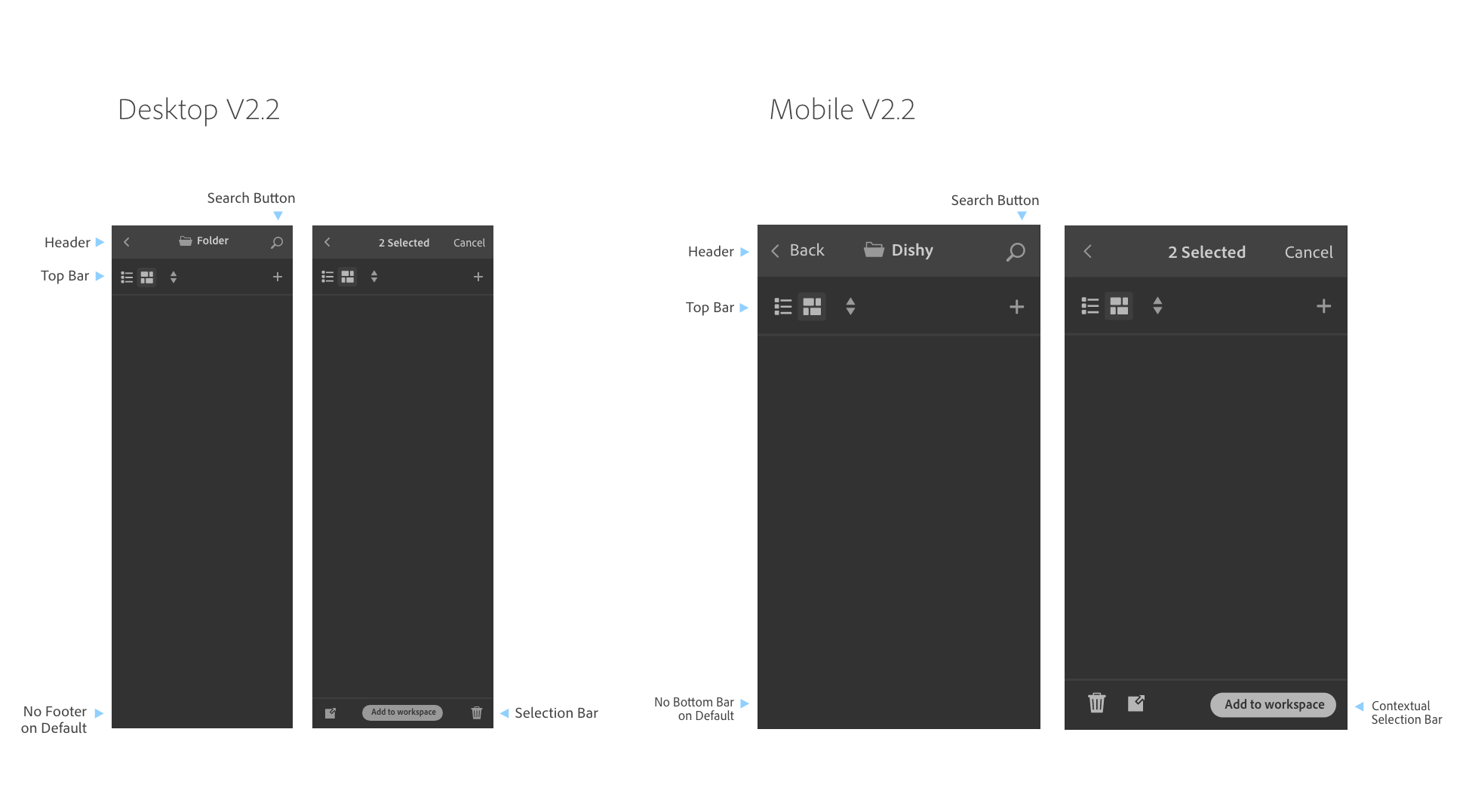
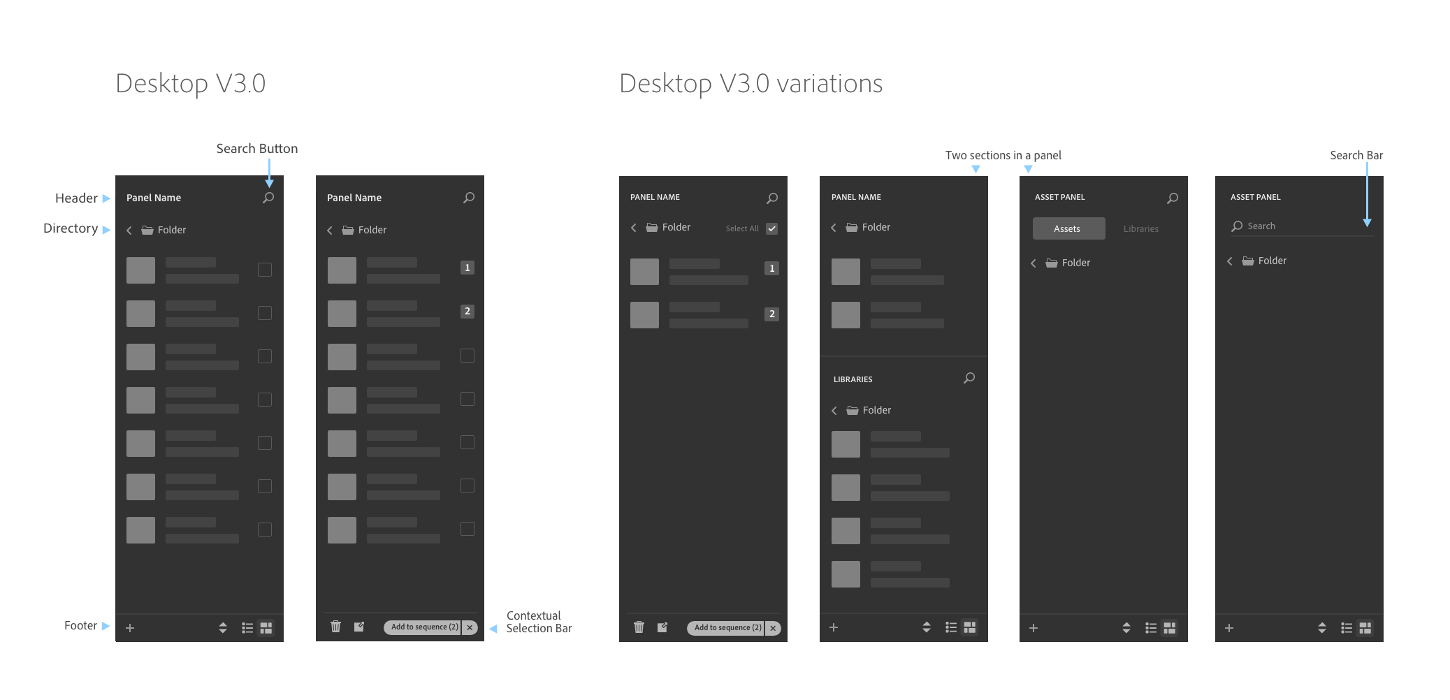
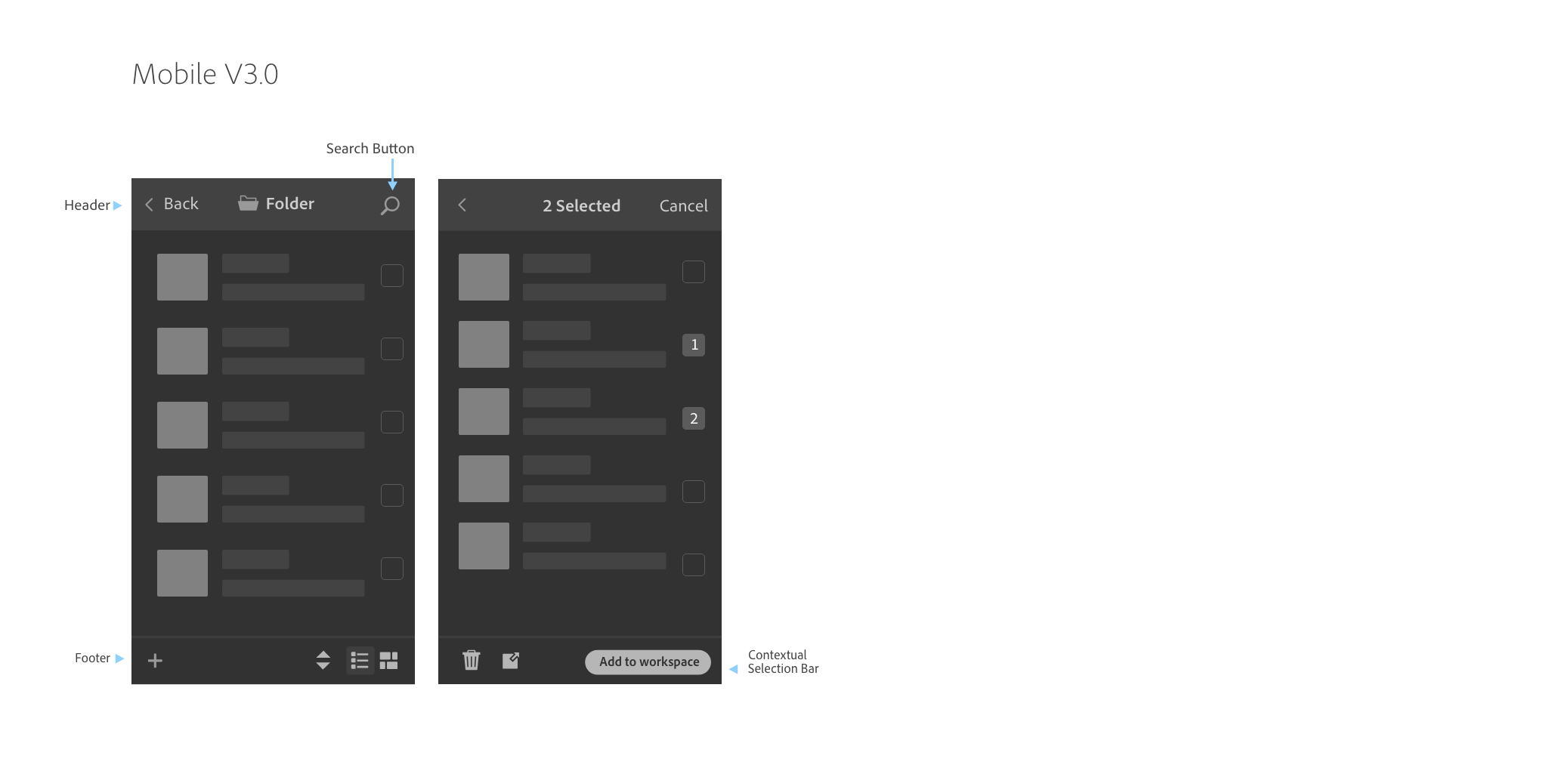
The design project which focused on the asset panel went through three rounds of iterations. At the end, I delivered a design analysis with the solutions I explored for the bigger team to consider and make a final decison.
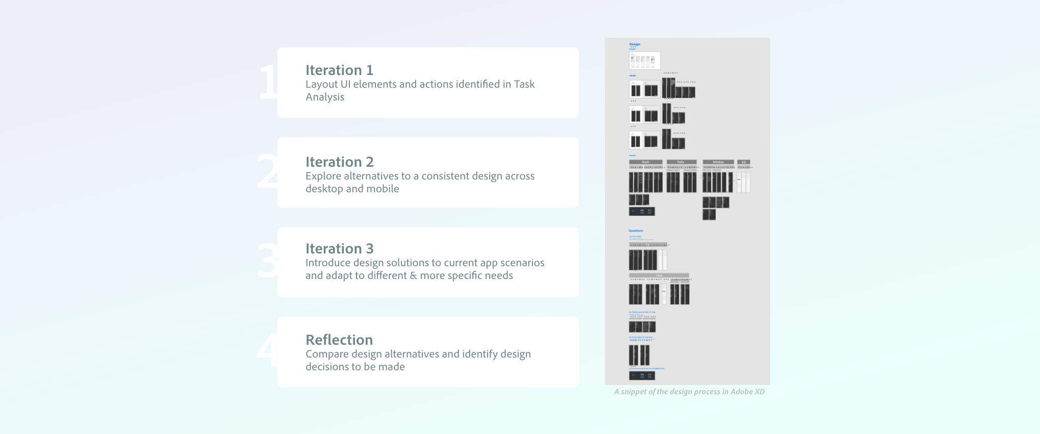
↑ Iteration process
Background
Part 1: Design (3 weeks)
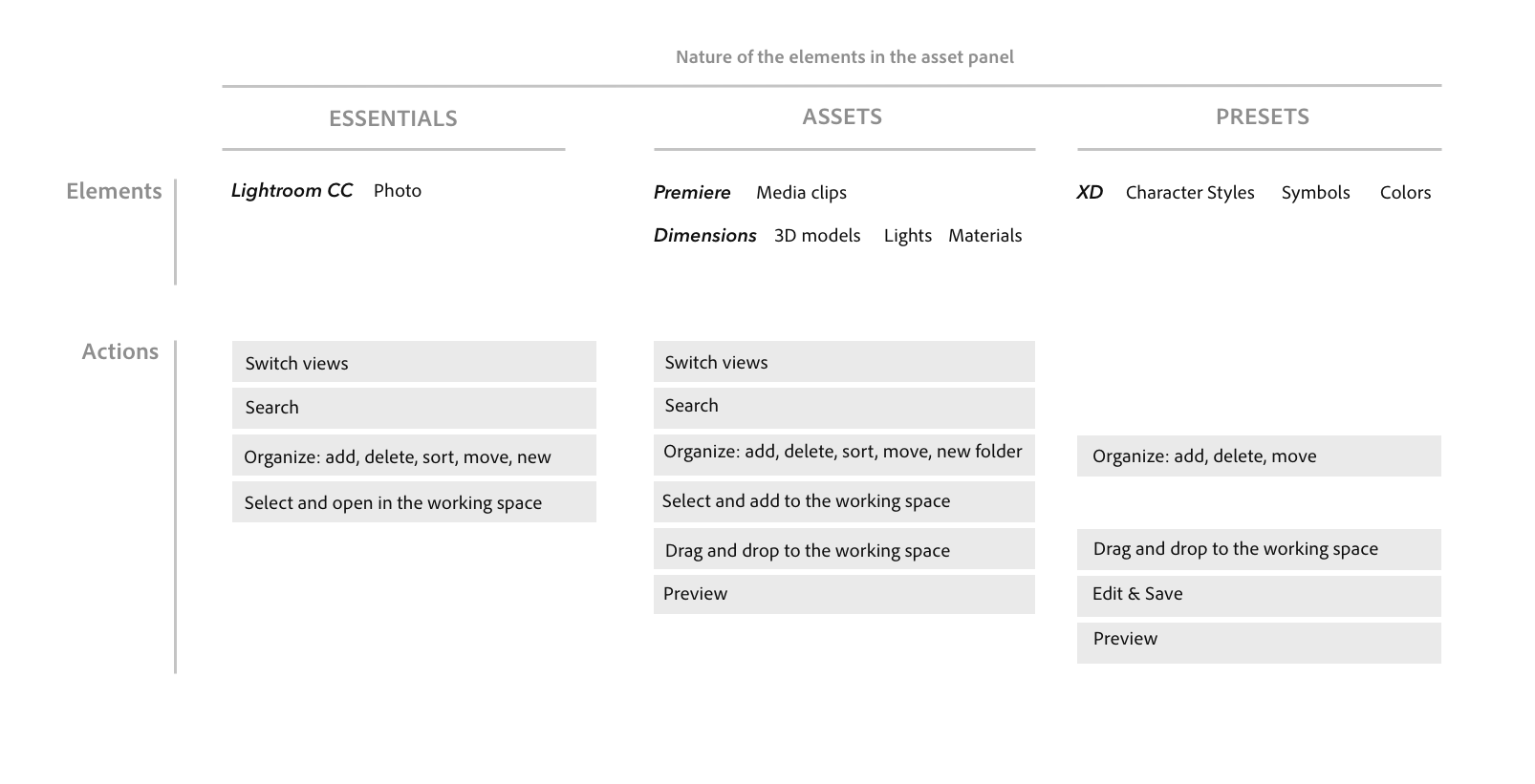
I was presented with a challenge to design for a consistent asset panel, which is part of the design framework but has not yet been looked into by the team at the time. The asset panel is an important component of the framework: it is the starting point for all creative projects, and one of the very first exposures for new users. But different CC apps have different workflows and assets that are very different in nature.
My work is an initial effort to explore a solution across all next-gen creative cloud apps. This project required me to undertake a thorough investigation into the needs of different apps, communicate with designers from individual product teams to iterate and make design decisions, and work closely with the design system team to meet the organization-level goal.
Round 4
Apply to real app sceanrios
It occured to us that it would be good time to go back to the real scenarios and see how this design look on the four apps. After trying out the design on all four apps in all possible states, I was able to better identify the design problems concerning the asset panel and describe the pros and cons in a more detailed way. This stage's design is not included due to NDA.
Reflection
Apply to real app scenarios
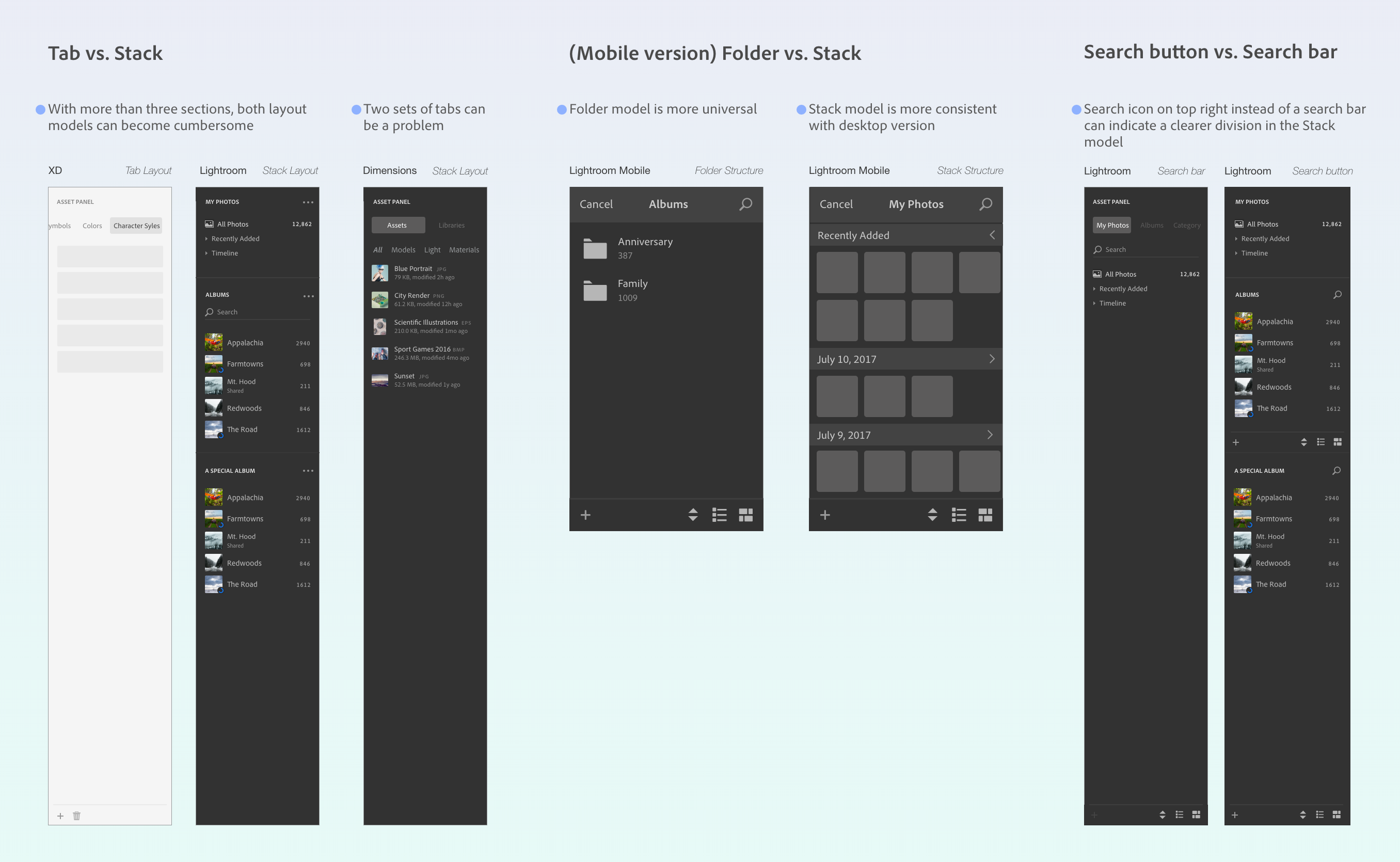
Due to the limited time of my internship, I was not able to be involved in the final decision making of the asset panel design. Instead, I delivered a comprehensive design analysis to the team to elicit further discussion on the topic. Three key problems concerning the asset panel design and respective analysis are shown below.
Part 2: Prototype (5 weeks)
To test the current framework, I helped prototype a new video-editing app
in Framer Studio. I was responsible for building the asset panel
component. Since the team was uncertain about some different designs, I
built two variations of the prototype (left tool bar vs bottom tool bar on
the desktop version; top bar with expanded function icons vs top bar with
an ellipsis menu on the mobile version). With the two sets of prototypes
we were then able to test out which one works better for our users.
↑ Prototype screenshot. Due to NDA, I cannot show any detail online.
Part 3: Research (4 weeks)
During my internship, I also worked with a senior user researcher to conduct research to gain insights into the design framework by testing on a new video-editing app. My job was to find out where the design framework needs to be flexible and where it can be standardized across apps and devices. The Research also investigated target users impressions and expectations of the framework. Findings from this research are used to inform the future direction of the framework as well as future research.
As the designer who worked directly with the research team, I coordinated with the researcher to come up with a research plan that could meet the needs of both my team and the video-editing app's product team-On one hand, we designed the questions and tasks to gauge the usability of the framework; on the other hand, we probed into user's video editing and sharing habits on both desktop and mobile platforms; we also let users walk through four benchmark tasks on the prototype to find out how the new app fit into their workflow.
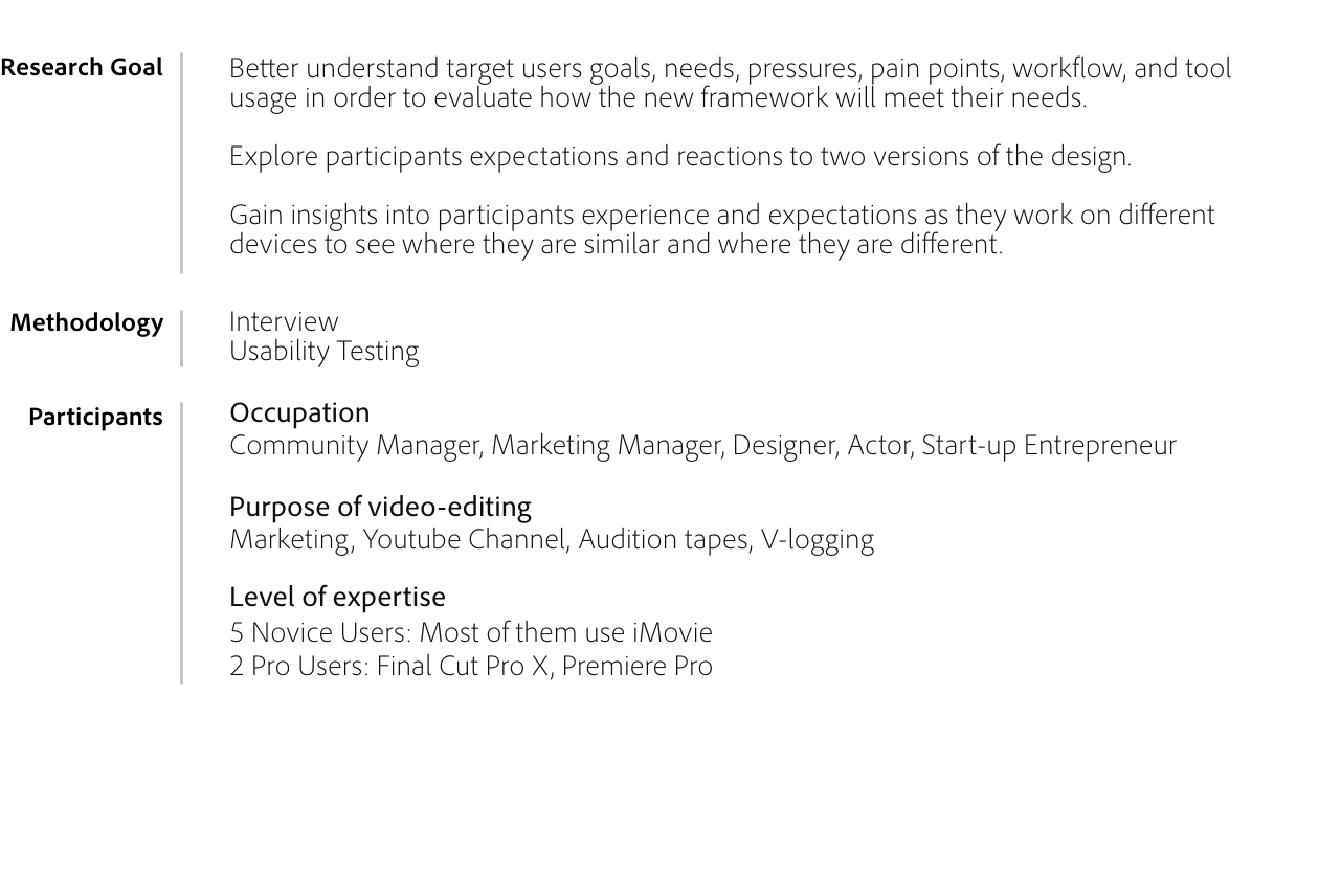
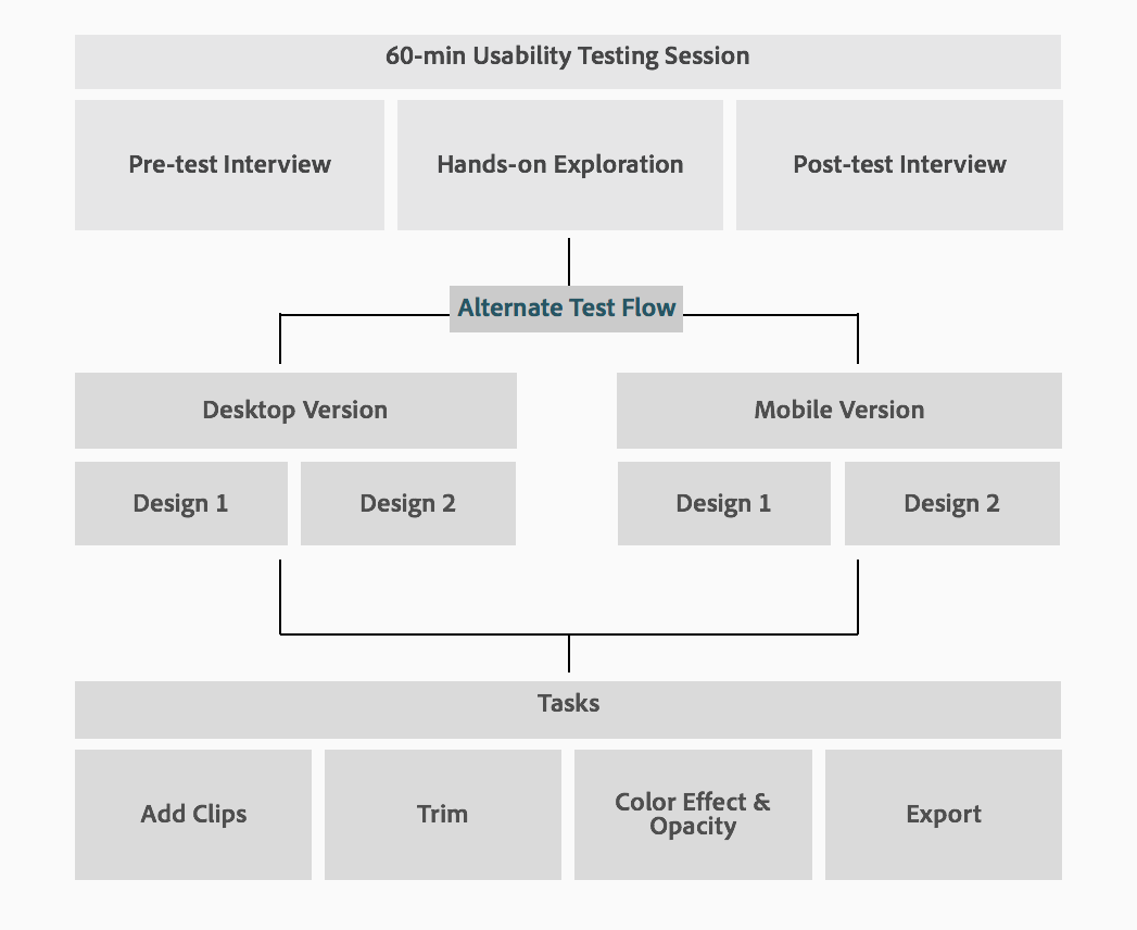
My research project provided strong design implications to both the framework and the new video-editing app: Project Rush. The recent beta release (Woohoo!) of Project Rush adopted several of my design suggestions. Below are two of the major research findings reflected in the current version:
1.
Left tool bar instead of bottom tool bar:
A left tool bar is a universal design element across next-generation
creative cloud apps. Though there was a concern that users are more used
to a tool bar on the bottom (a more common design for video editing
apps), new users located tools fast on the left tool bar and had no
problem with the new layout.
2. Say no to ellipsis on the top bar: On the mobile version, key function buttons should all be shown on the top bar, especially the share/export function. Users were very confused about where to go when the function was hidden in the ellipsis/drop down menu.
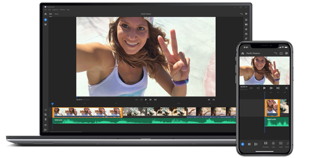
↑ https://www.adobe.com/products/project-rush.html
Click here to see what I learnt from the research experience on Medium :)
Reflection
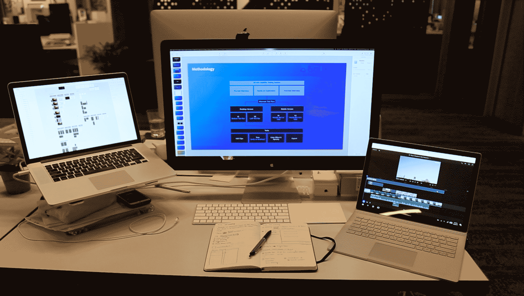
↑ My workstation showcasing the three projects I did (left:design-middle-research;right-prototype)
I felt fortunate to have tried out three different types of projects and have worked with a group of most talented designers.
Working on a team whose primary function was to coordinate designers from different product teams to reach a organization-level goal turned out to be a very special experience. I have learnt how to take initiative, how to make use of all resource available, and how to thrive within a huge distributed team. Through the internship I also became more aware of my own strength: I am able to quickly pick up new things, and adapt to a new environment of people as well as technology; My skills and knowledge provide me with enough flexibility to take on a wide variety of tasks within a product team.
"Yiran was able to work quickly and proactively with minimal direction.
She was able to collaborate with multiple contributors and stakeholders,
gather feedback, define solutions, test assumptions and ultimately add
to Adobe’s design language."
--Brett Marshall,
Senior Experience Design Manager
I want to thank my manager, Brett Marshall, for providing me with so many great opportunities and inspiring the best of my potential. Also many thanks to Rebecca Gordon for being an awesome mentor and guiding me through my first research project in an industrial setting.
Thank you for reading!


