Background
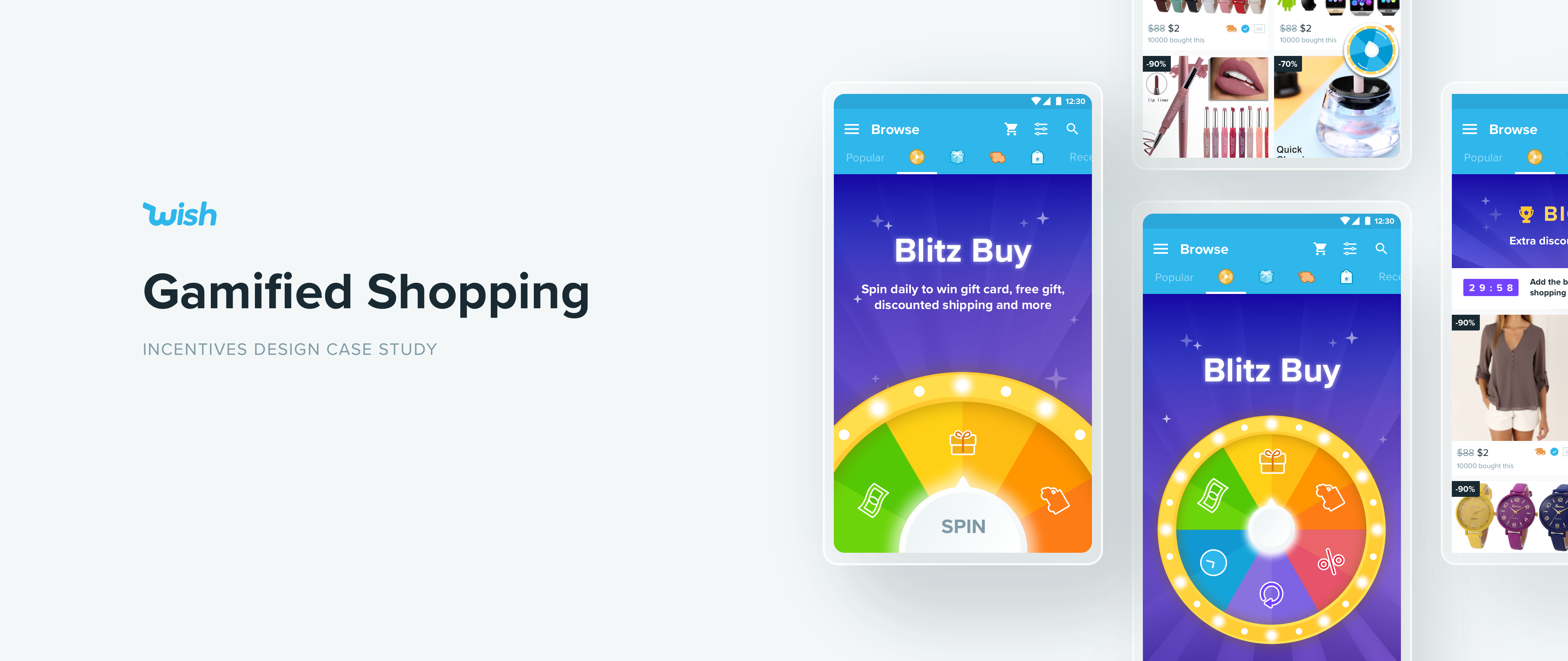
Wish is an ecommerce platform that serves an overlooked segment of value-conscious shoppers. This means that for Wish's users, a little bit of monetary motivation goes a long way. This made Incentives an important sector of the business. It’s also a very exciting field to design for: I was able to experiment with some wild ideas to elevate the shopping experience on Wish, especially through gamification.
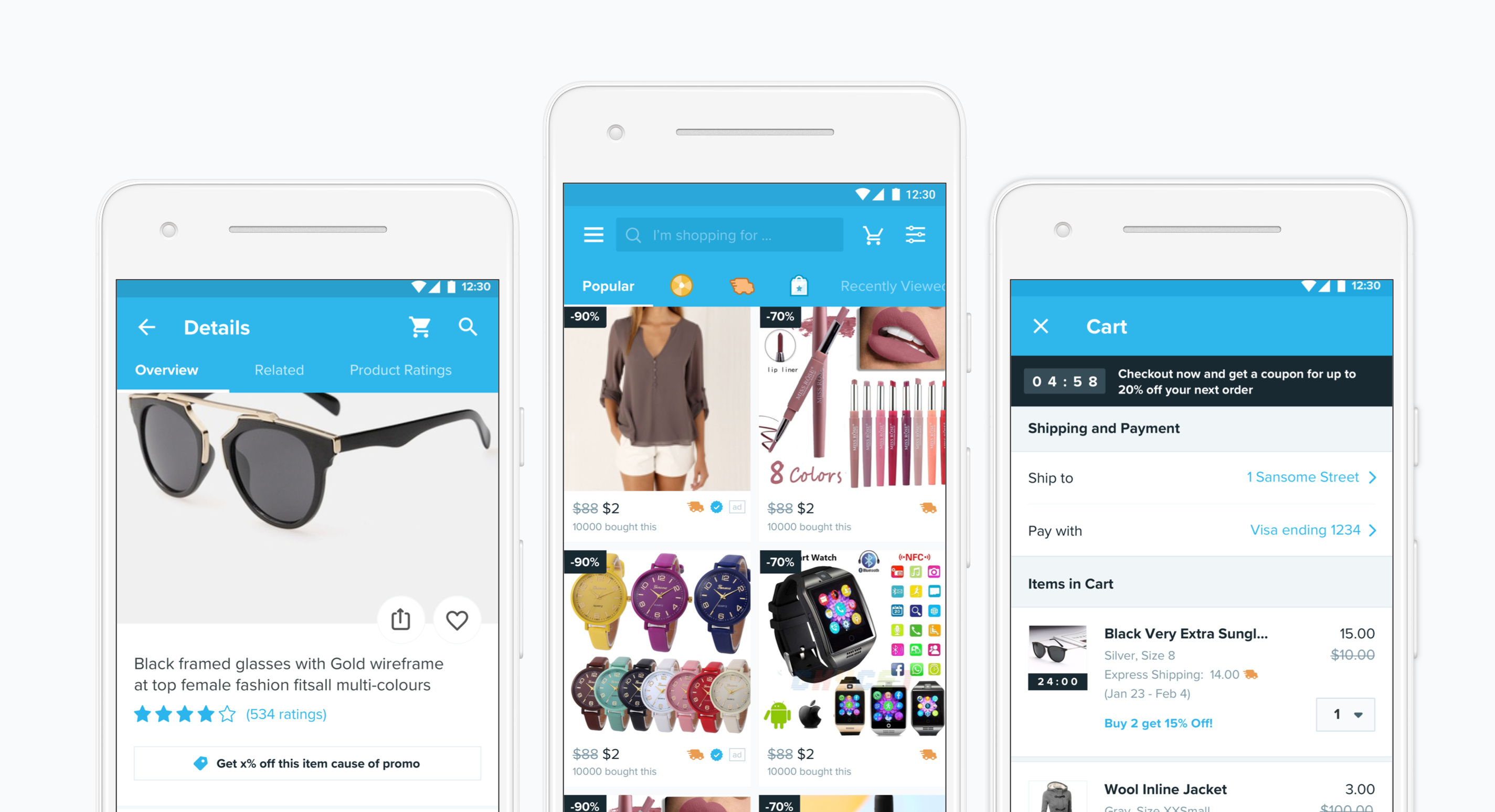
↑ Wish Android App
Incentives Framework
To better understand and build up incentive programs on Wish, I worked with my PM to establish an incentives framework. We identified 5 key goals along with the existing features that serve each goal. It helped us understand which area within the framework needs more attention (e.g. Retention 1, or long term retention only has one program); We also were able to see how some program has a bigger impact as it touches on many different key goals, e.g. the Blitz Buy game .
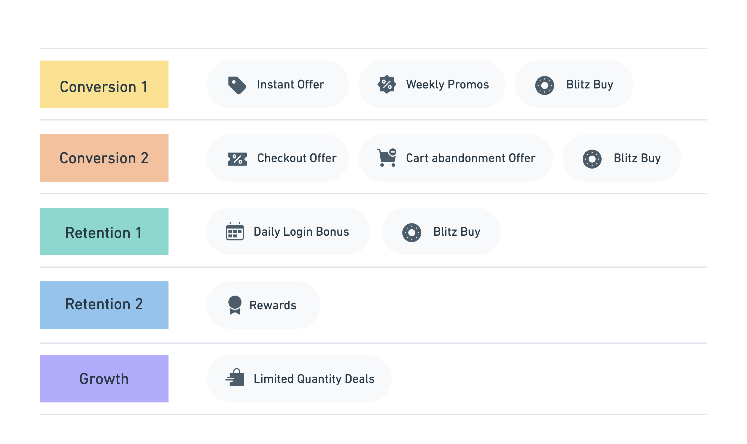
↑ Incentives framework and existing programs
Project 1: Blitz Buy Re-engagement
Blitz Buy was the first and most impactful gamification feature in the app to date. Currently, when users spin the wheel, they will unlock a feed of 10-100 items that have an extra discount. This feed is highly customized based on the user’s recent views. We learned that users has a much higher conversion rate on this feed compared to the main feed.
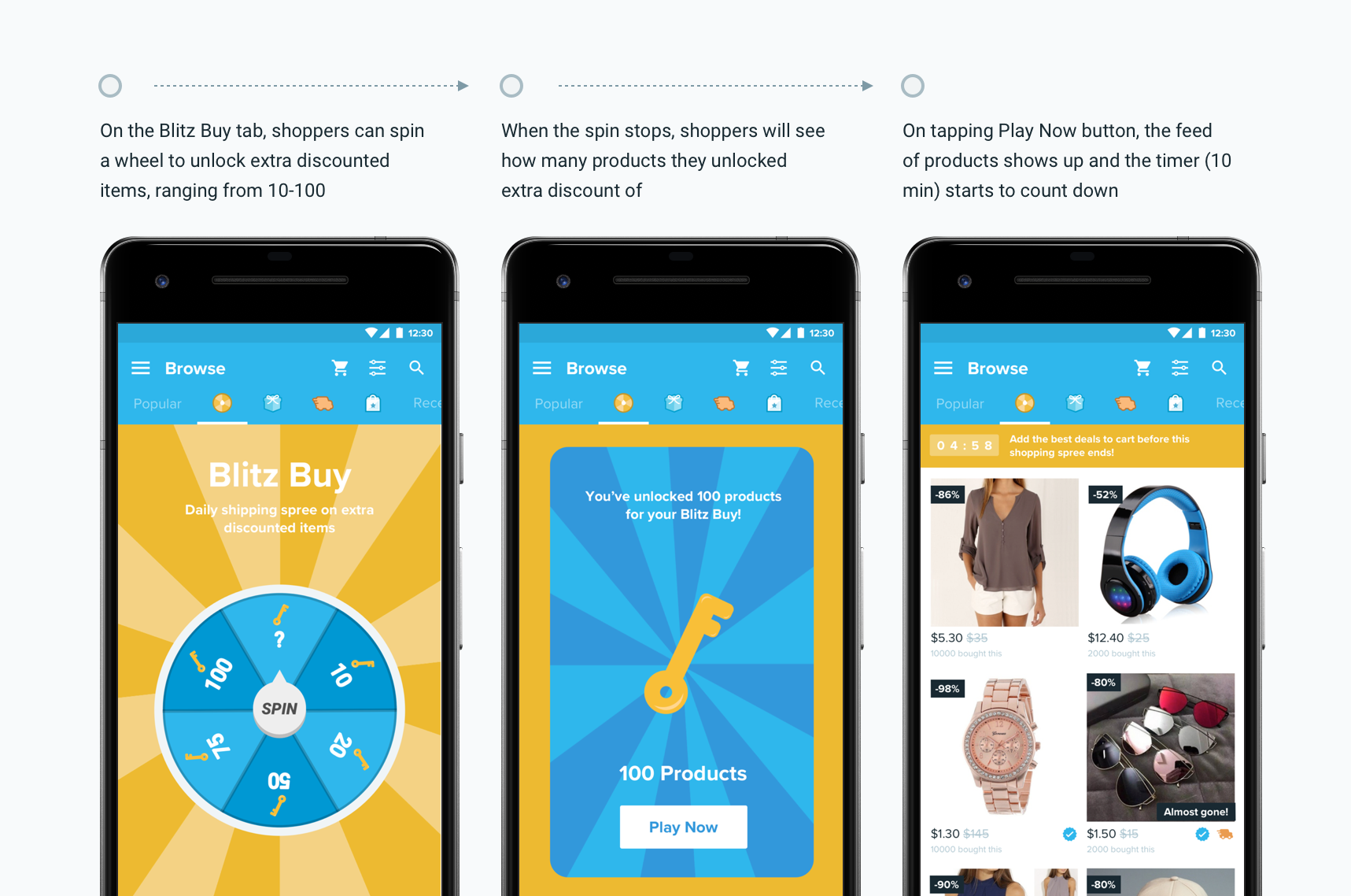
↑ Blitz Buy Before the Revamp
Currently, 5% of the user go to the blitz buy tab, yet it has proven a huge potential to generate sales. What if we can increase this number and drive more people to play the game?
Ideation
After brainstorming different solutions, the team and I narrowed down to the following ideas:
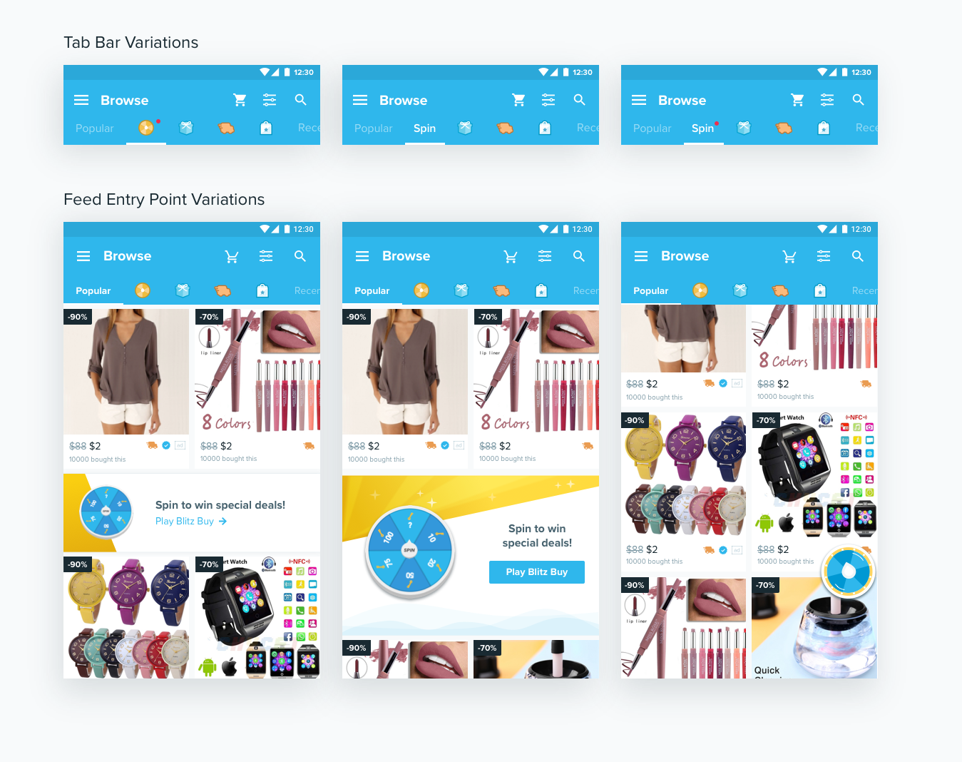
↑ Variations of tab bar and feed entry points that we tested in the experiment period
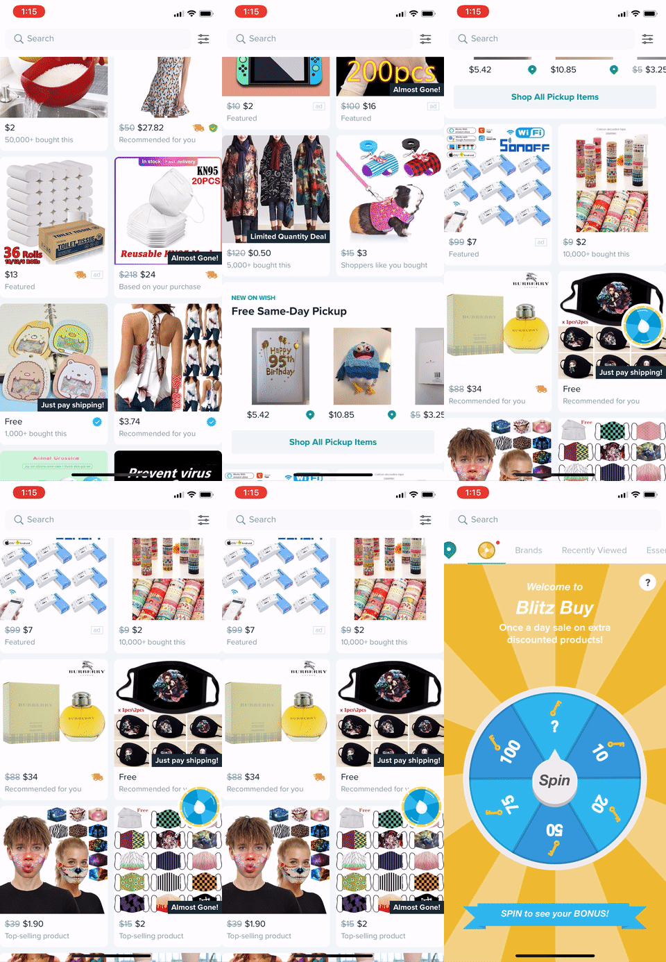
↑ Floating Button Design Implementation
Results
After rounds of experiments, we found out that the combination of red badge and a floating button on the feed has the biggest impact on our key metrics: It increased GMV by 2% and traffic to the conversion on blitz buy tab by ~120% consistently.
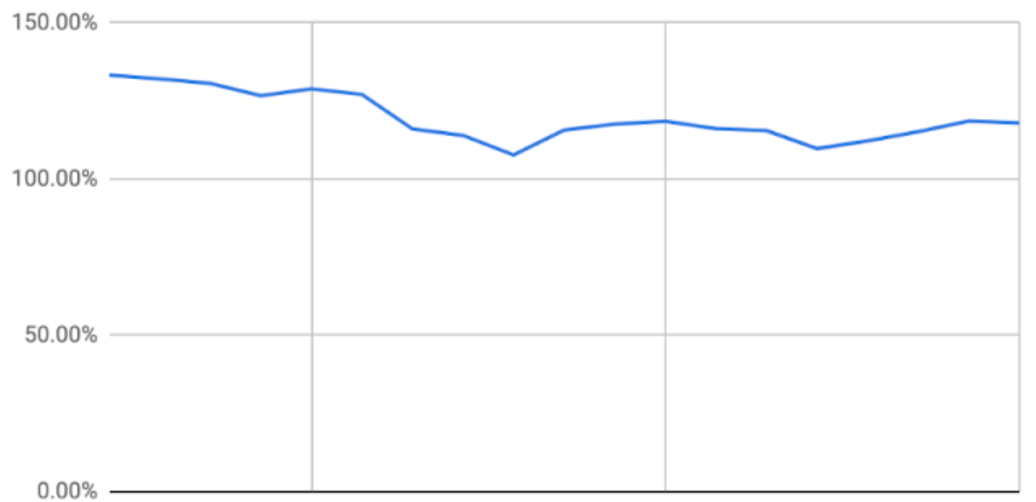
↑ Blitz Buy Conversion Trend over a 3 week experiment period
Yes! But...
Although the two additions have proven to be successful, they are also very aggressive as a feature to keep showing to everyone in the app, and the effectiveness will be sure to wear off in the long term due to fatigue.
To understand how to make the features more effective and less intrusive, I carried out a user testing to understand the impact of this design on a qualitative level.
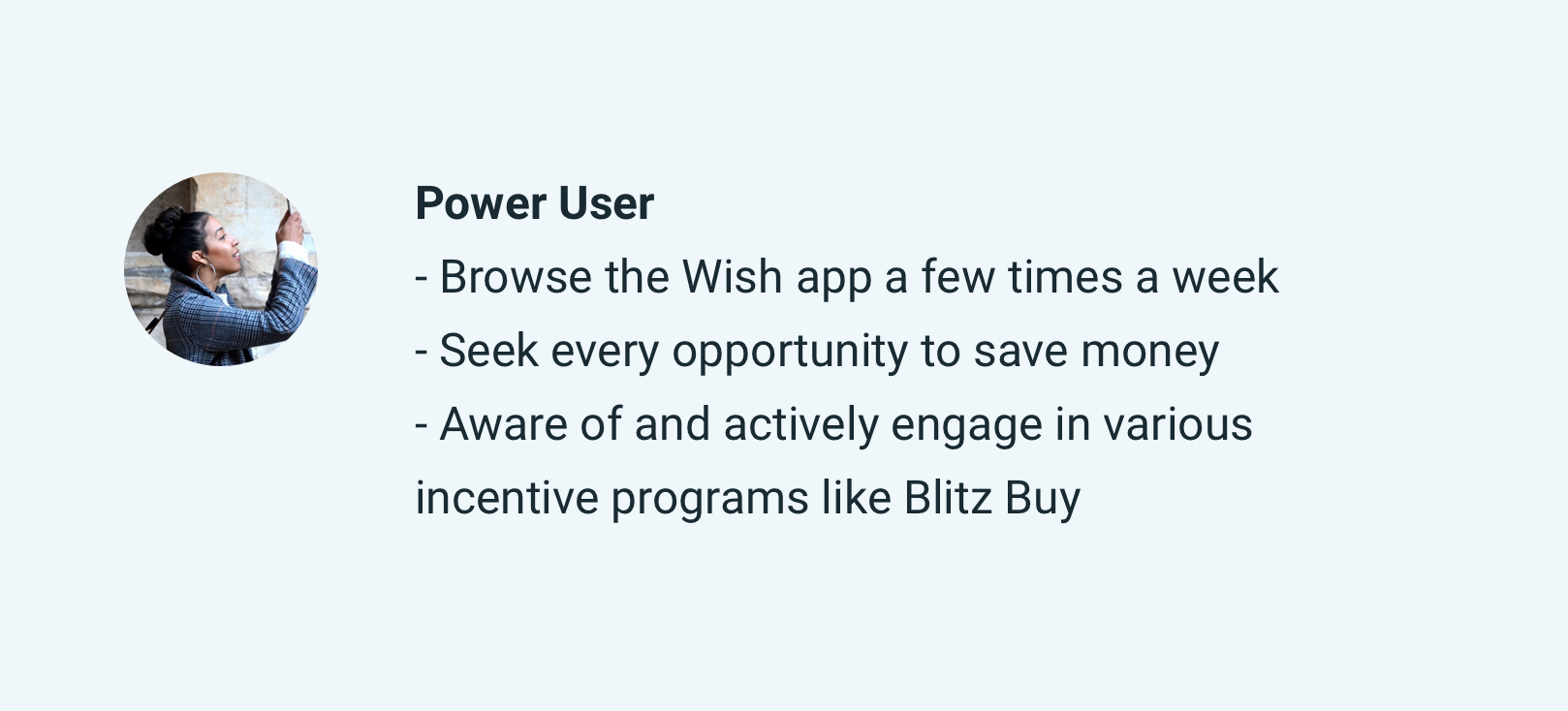
Persona
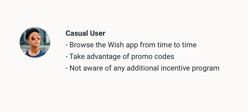
A pattern emerged from the user study: there are two distinct groups of users on Wish when it comes to incentive/gamification programs. Below is some key characteristics of the two groups respectively.
Research Findings
We found out that the floating button is effective to drive exploration for new & casual users, yet more intrusive to power users. This is because the floating button can inspire curiosity of new/causal users who are not yet aware of the game, while power users have already built out the habit of going to the Blitz Buy tab regularly.
As for the red badge on the Blitz Buy tab, the effect is also two-fold: Power users welcome the feature as it reminds them to go check out the tab on a daily basis, yet new and casual users easily neglect the tabs.
Participants also voiced that they wouldn't pay much attention to either feature if they are in the app all the time, validating the assumption that persistent exposure of these reinforcement features will reduce the effectiveness in the long run.
A new strategy!
Based on the persona and user testing findings, we designed a customized strategy to engage different user groups effectively in the long run:
1. For new users, show floating button and the red badge.
2. For power users who interact with Blitz Buy on a regular basis, only show red badge for people who interact with BB on a regular basis
3. For existing users who haven't use it for a while, take out the red badge and show floating button
Project 2: Visual & Incentives Revamp
In the first project, we managed to increase the traffic to the Blitz Buy game. However, the game itself has become stale over the years and lack the level of excitement to hook up more active players.
To give a boost to engagement, we need to refresh the visual and introduce diversified incentives of the blitz buy game
Gamification model
Before diving into the redesign, I spent some time studying the various gamification principles, models and case studies to identify new opportunities for the Blitz Buy.
One of the most comprehensive and most referenced model in gamification is the Octalysis framework developed by Yu-kai Chou.
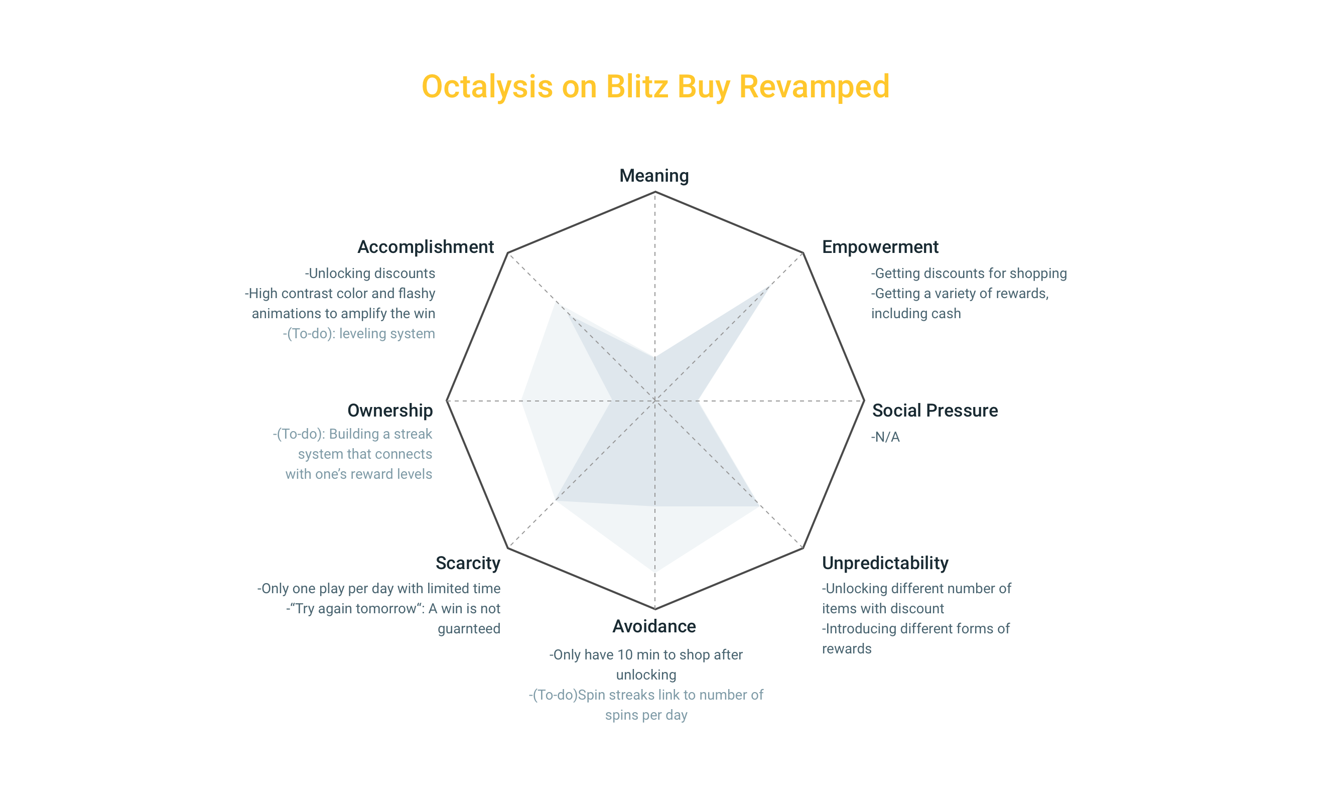
Through an analysis on Blitz Buy using the framework (below), it's becoming clear that Blitz Buy is scoring low in several dimensions. Of course, as a promotional-focused game in a shopping app, its limited by its scope to strive for a high score in in all aspects (e.g. Meaning, Social Pressure). However, we can still see opportunities to improve in a few others, and to give a further boost to the existing strengths.
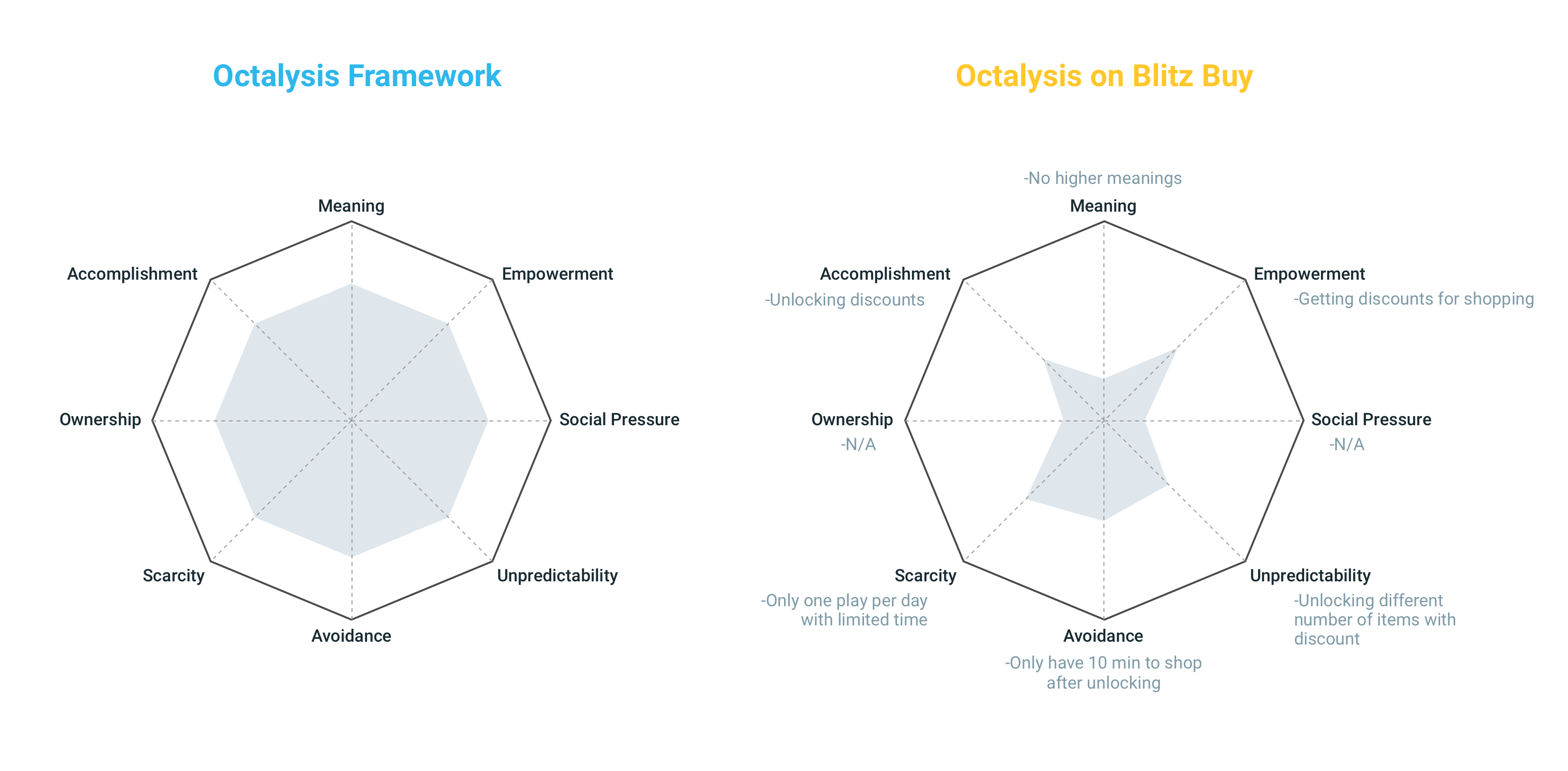
↑ Octalysis model (left) and Octalysis on the current Blitz Buy game (right)
Color & Visual Explorations
Internally, we have long been seeking an opportunity to refresh the color palette and make the wheel more skeuomorphic to engage users from the first sight. Through the preliminary user testing, we also found out that a majority of new users to this page don’t understand what the keys and numbers represent on the original wheel. Therefore, my goal is to find out a new visual solution that is more appealing and effective in communicating the game mechanism.
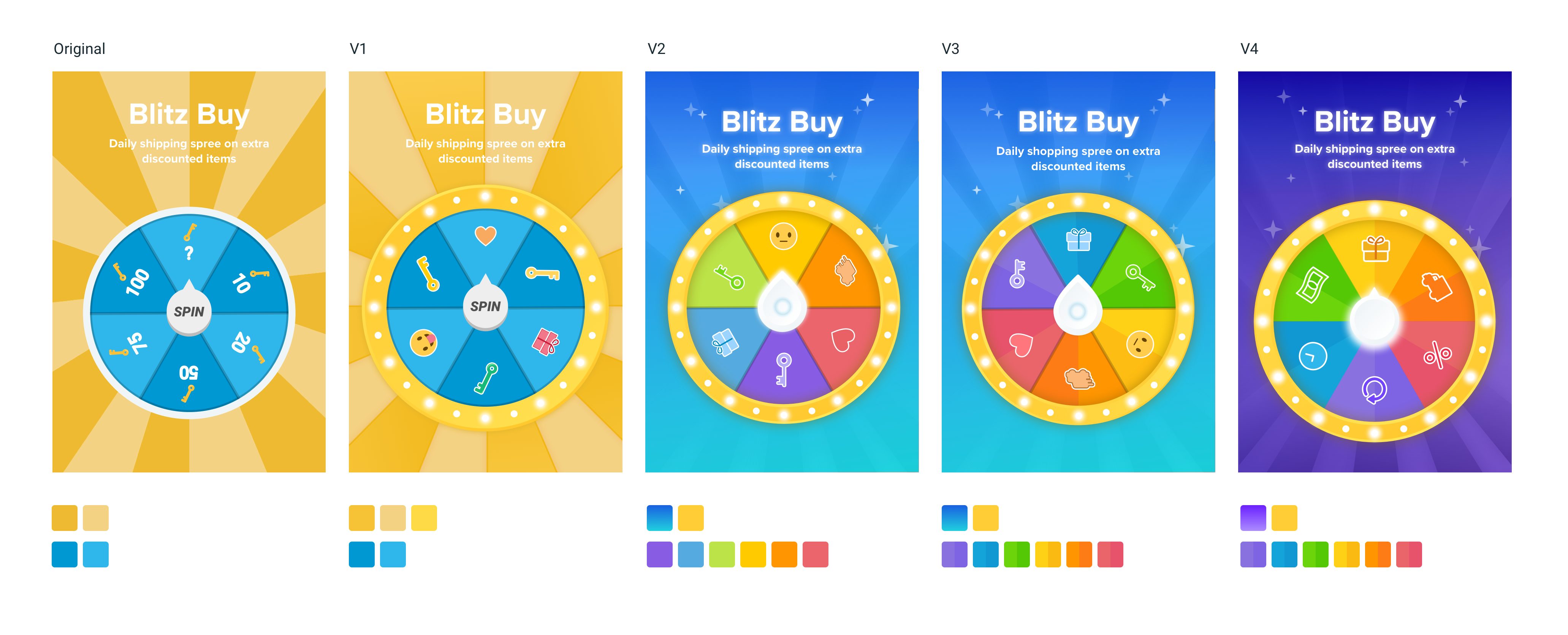
↑ Major iterations I did with Blitz Buy New Visuals.
I went through 4 major iterations, each round adopting feedback from users as well as team critiques.
*Fun fact*: Whenever I'm working on this project, the entire team would be attracted by all the colors on my screen, gather around me and offer a wide variety of opinions. As you can guess, this process made me finally become 100% comfortable with showing and receiving critiques on my WIP.
Gamification exploration

↑ Game mechanism iteration
After a few rounds of explorations inspired by a variety of real world games, we evaluated feasibility and landed on V4: Using icons to represent prizes, and showing more variations.
To diversify the prize, we started by adding 4 new prizes: free gift, category deals, express shipping discount and wishlist discount. We also wanted to introduce an empty slice on the wheel: If a player lands on the slice, they won’t get anything and will be told to try again tomorrow. The goal is to improve the Unpredictability and Avoidance aspect of the game, and to not discourage players, we planned to make the probability very low.
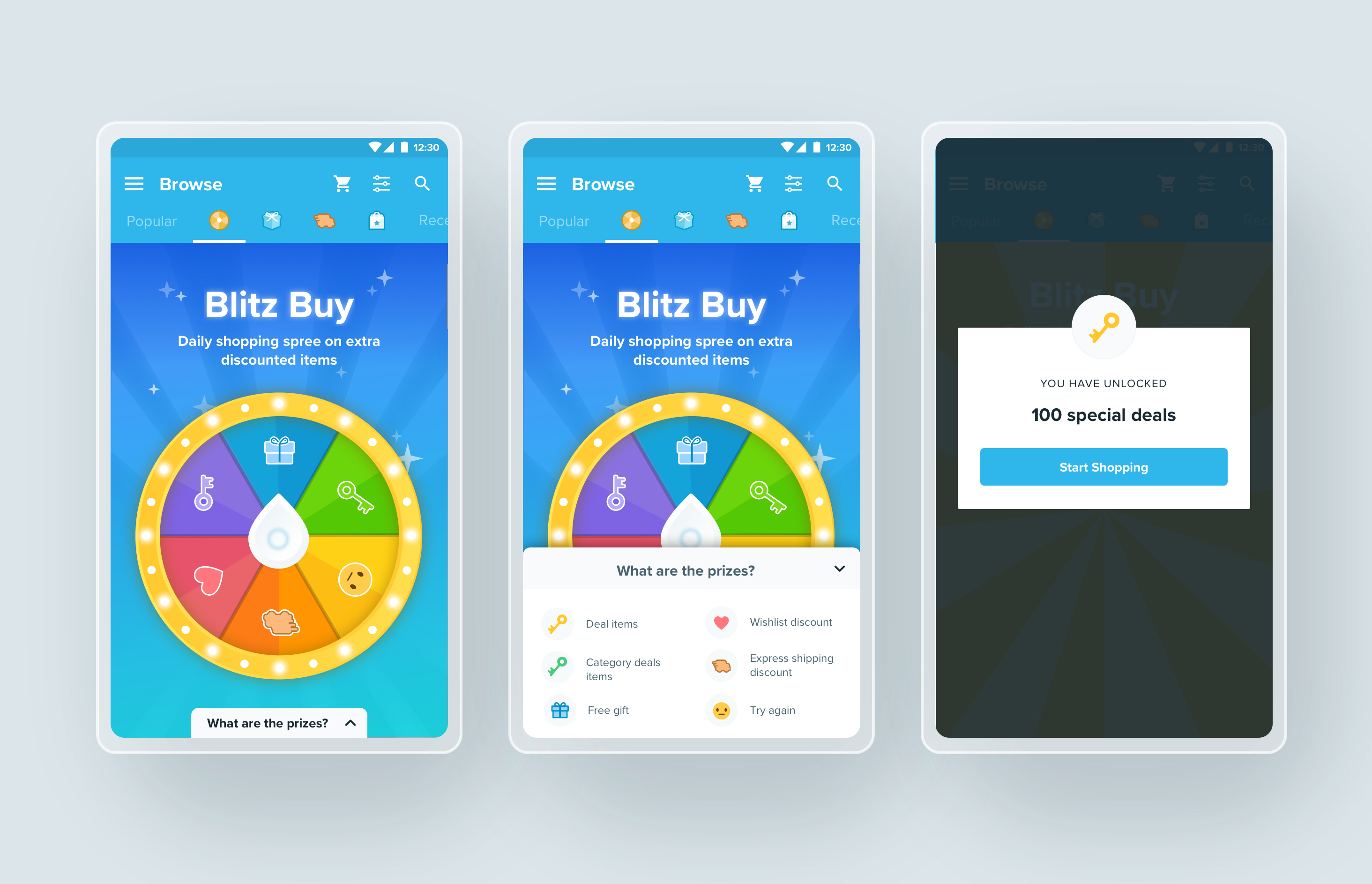
↑ New Blitz Buy V1
We ran a round of user testing based on this version below, and found out a few issues: All participants reported problem understanding the icons on the wheel just by looking at the icons After reading the explanations, some people still were confused about the difference between category deals and regular deals. Participants think ‘Try again’ is too discouraging...
Based on the feedback, we explored a new angle to intrigue players with the potential of a big prize, while not confusing/overwhelming them with too many abstract prizes. This led us to the version below:
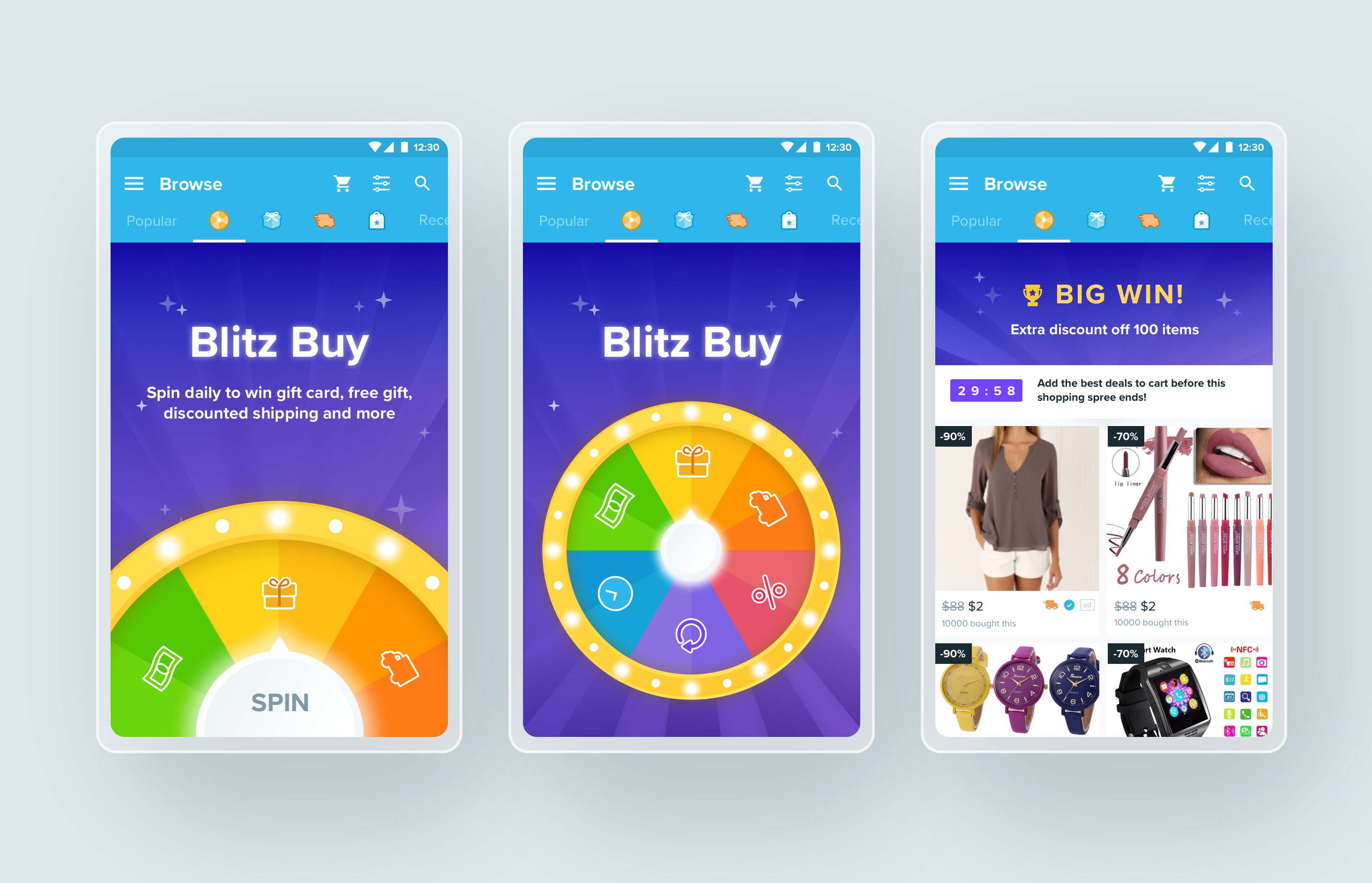
↑ New Blitz Buy V2, based on user testing results
How it works: When entering Blitz Buy, the player will see a half wheel that shows three slices: a gift box, a bill, and a truck icon. The subtitle explained that they can win free gifts, gift card, and free shipping, corresponding with the three icons. The pin has a pulsing light, prompting people to tap and start the game. The wheel will then scale down and ascend to the center of the screen as it begins to spin.
When testing this new version with users, we got more positive reactions. All participants thought the new theme is “fun and exciting”. Almost all participants understand the value they could get from the game at first sight of the landing page. Furthermore, all participants thought it was very likely this new game will change how they use Wish.
Final Design: Animated Demo & Entire Flow
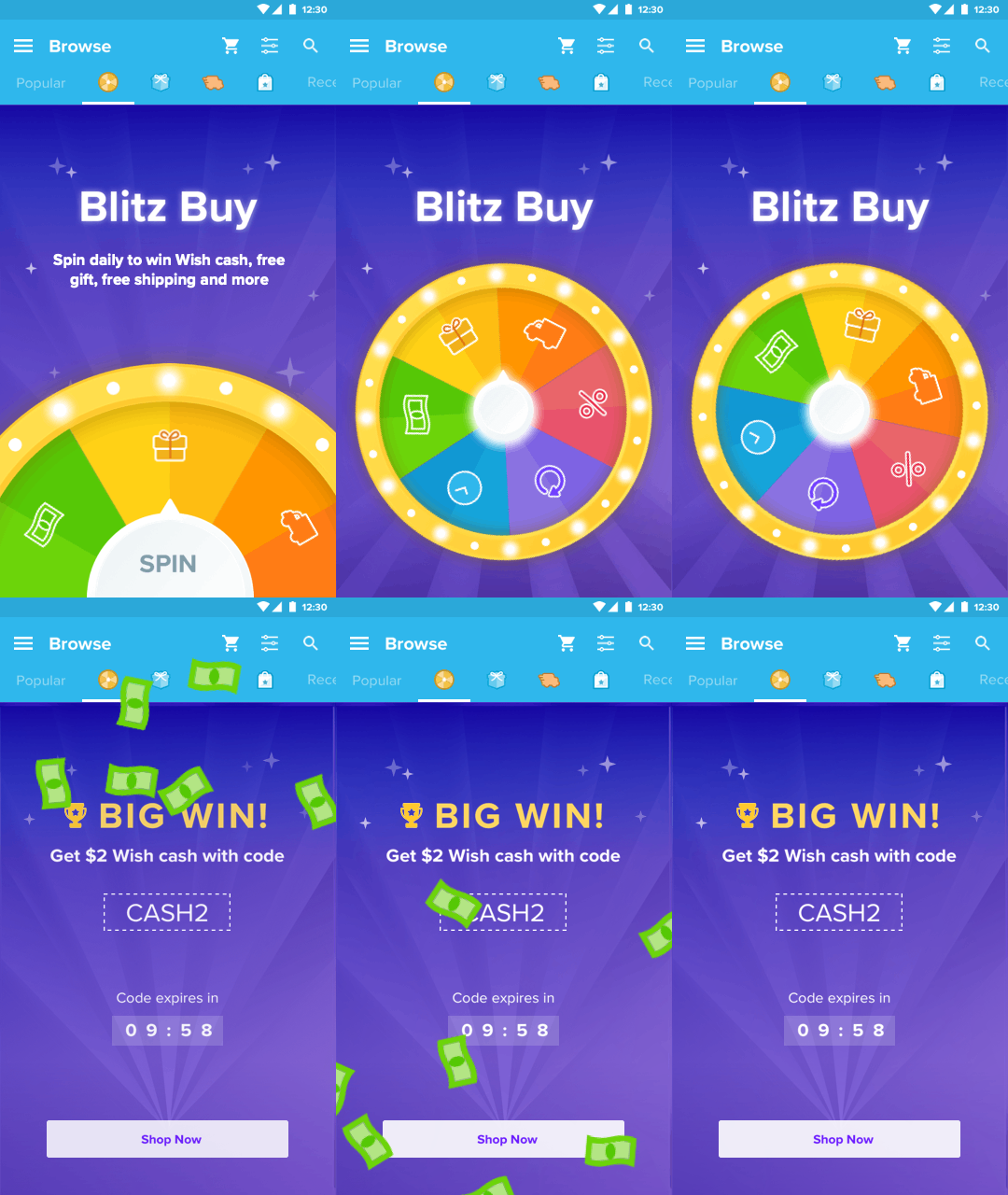
↑ Animated Demo
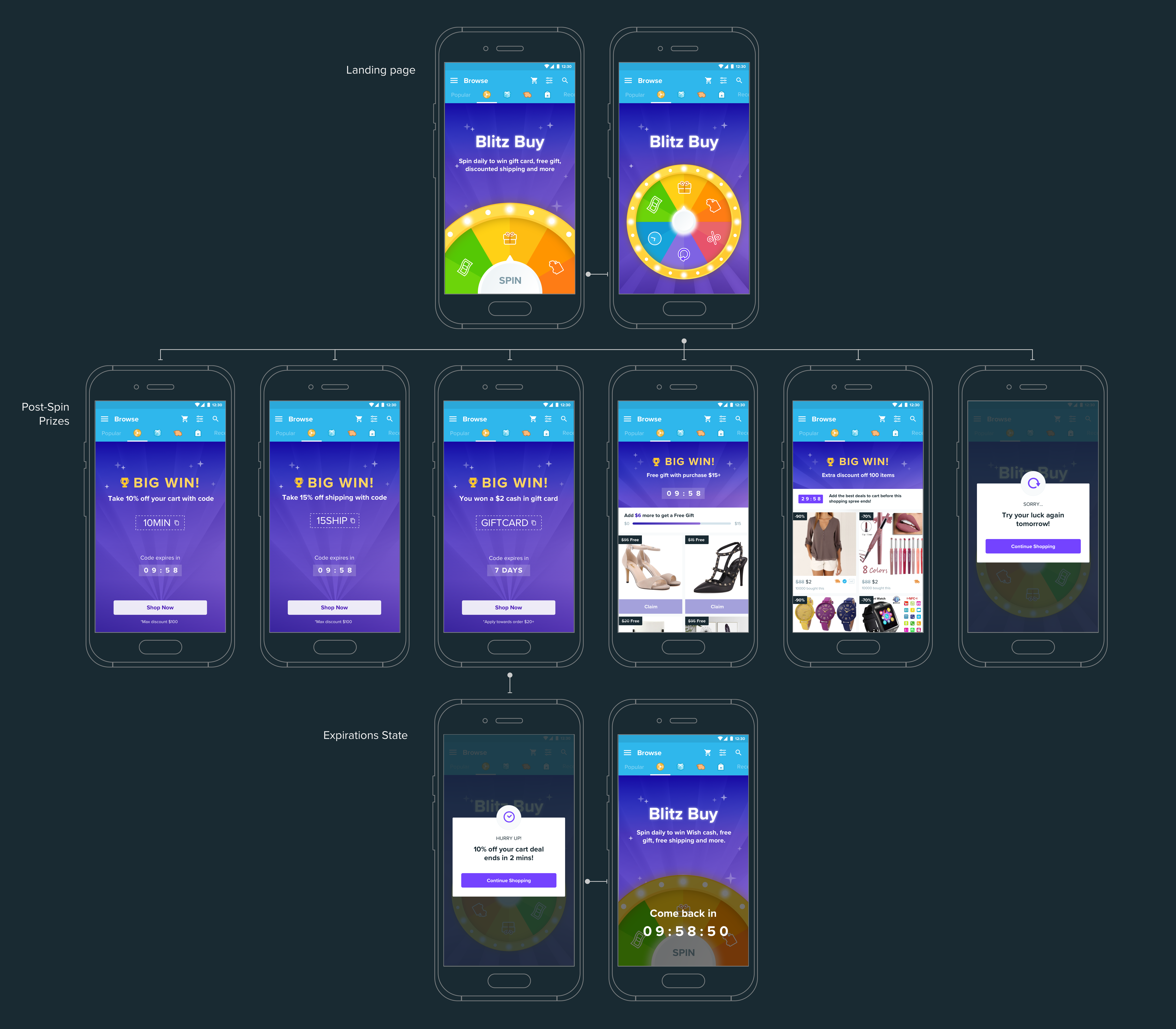
↑ Final Revamped Blitz Buy Flow
Reflection
Once the new Blitz Buy game is ready to launch, we are going to monitor how the new design performs across our key metrics: Conversion 1 (Add to Cart), Conversion 2 (Checkout), Retention 1 (Short term retention, or engagement level). With all the new features introduced to the game, we are also hopeful that Blitz Buy can address the other two metrics in the framework: Retention 2 (7+ days long term retention), and Growth (feed scroll, time in app etc.)
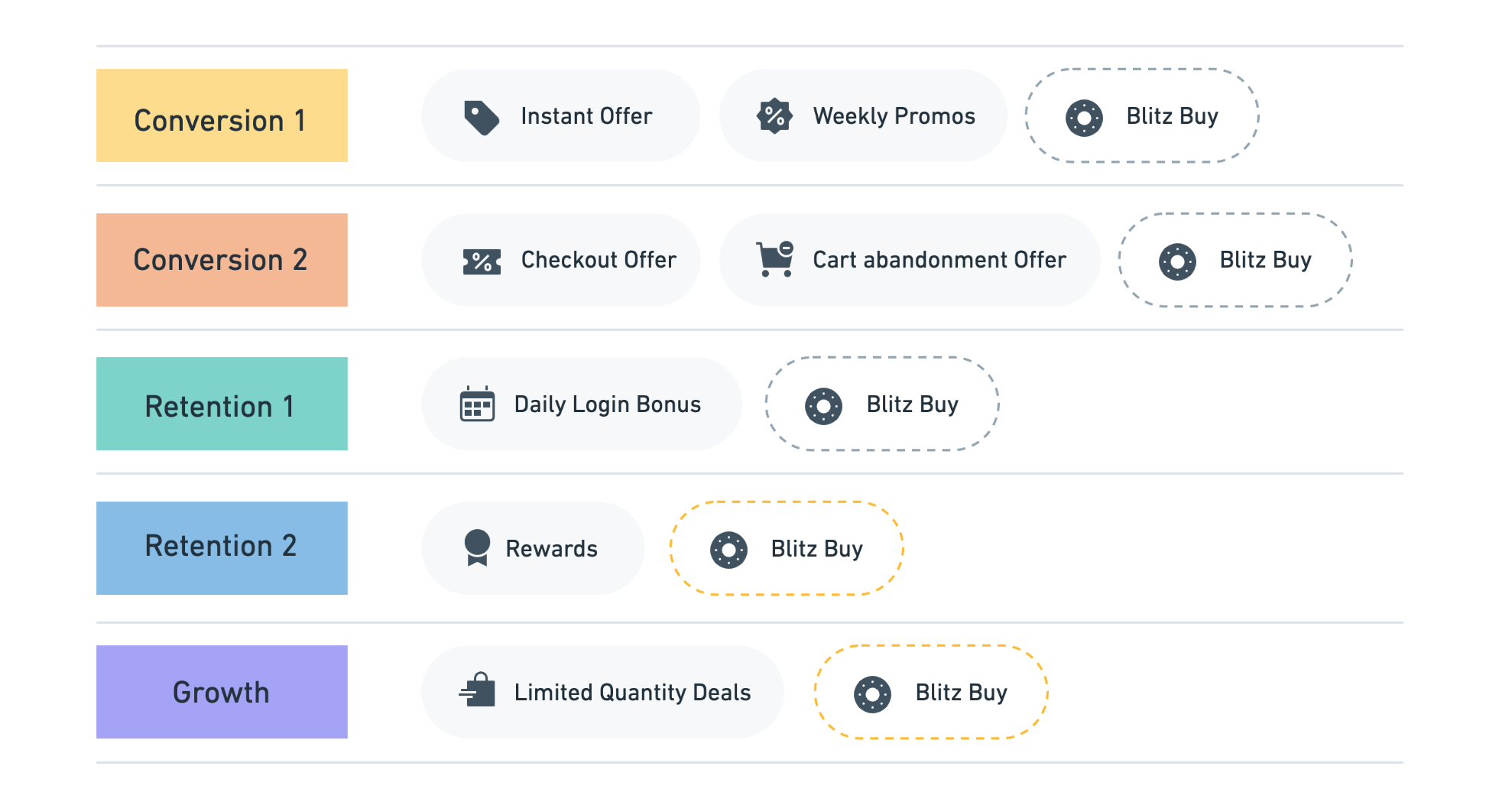
↑ Incentives Framework
As a next step, we are going to explore ways to further optimize the game following the Octalysis. Currently with the new design, we are able to see improvement on Unpredictability, Scarcity, and Accomplishment. If we can link prizes with the user’s engagement level by introducing streaks and leveling, we can make the game even more effective with the help of Ownership and Avoidance.
Thank you for reading!
