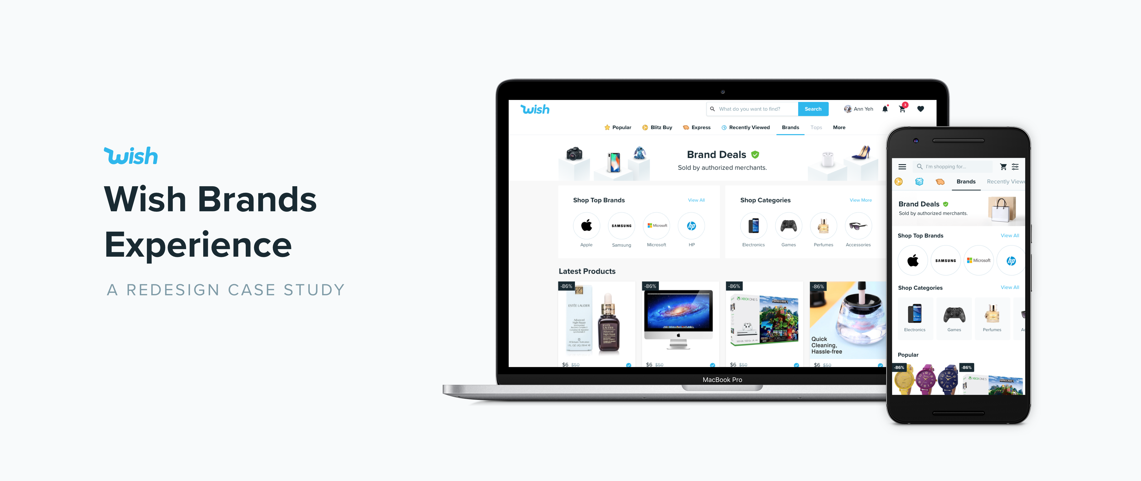
Background
Wish is an ecommerce startup that strives to offer affordable and accessible goods to shoppers around the world. The majority of the items on Wish are unbranded and made in emerging countries. However, as Wish keeps growing, we are trying to branch out our offerings to include discounted local brands, especially in the US market.
In order to bring on brand partners on Wish and drive sales in this new category, the product is in great need for a refreshed brands shopping experience.
Understanding the problem
Business Requirements
One of our important stakeholder of the project was the BD team who work with brand partners. To help make it easier for brand partners to come onboard, the BD team had two requirements for the redesign:
1. The new brands experience should be elegant & versatile that complements any consumer brand;
2. It should be part of the Wish app, but at the same time unique and different from the regular Wish experience.
User Pain Points
Although we already have a brands tab on Wish since the very beginning, it has a limited inventory and low traffic. To fully understand user’s pain points with the current brands tab, I carried out a preliminary user testing with 7 wish shoppers.
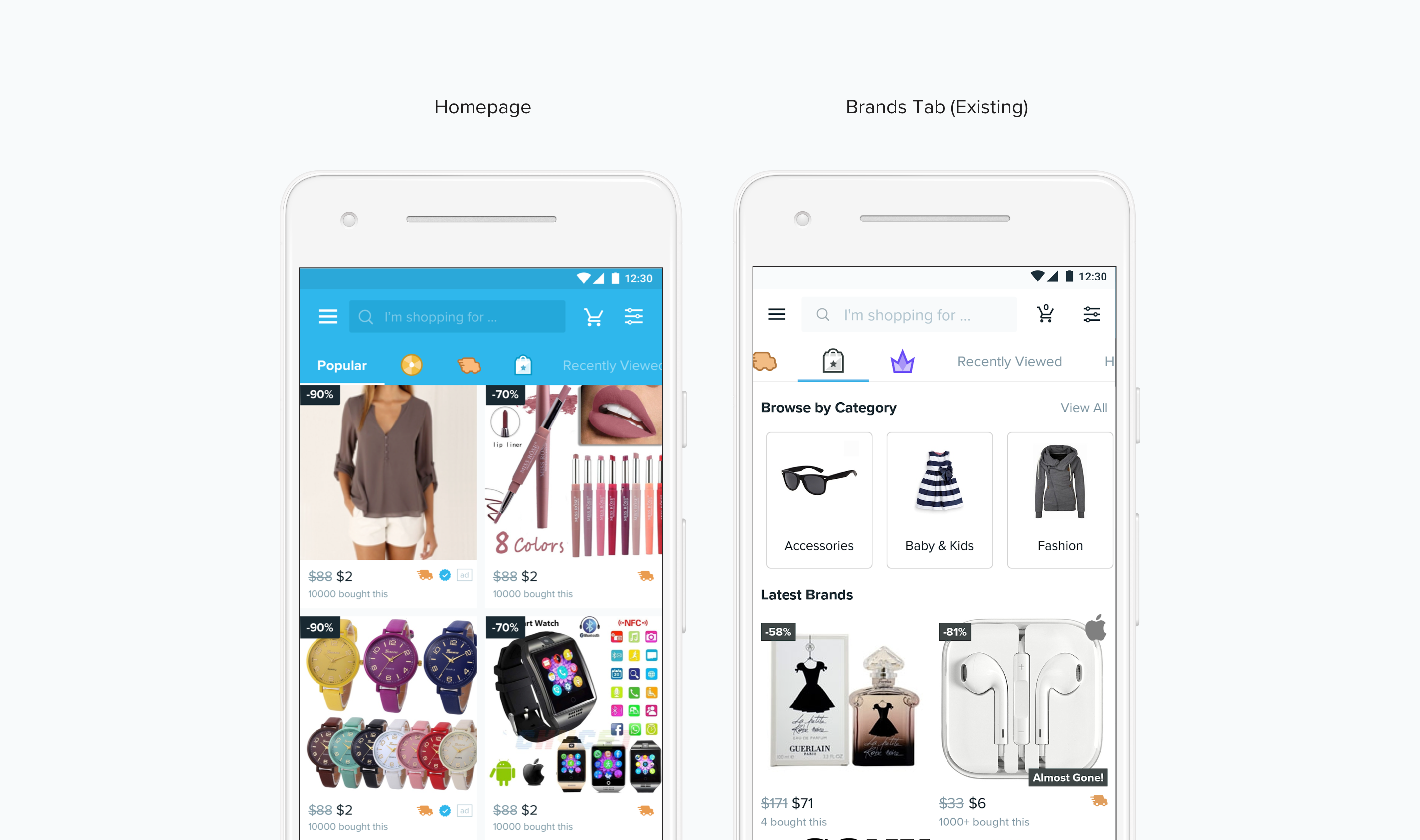
↑ Existing Wish homepage and the brands tab
From the user testings, we identified some outstanding usability issues of the brands tab:
1. Shoppers don’t understand the tab icon;
2. On the brands tab, shoppers have trouble understanding how the experience is different from the popular feed on Wish;
3. Shoppers have trouble exploring brands of interest through the current navigation system.
Goals
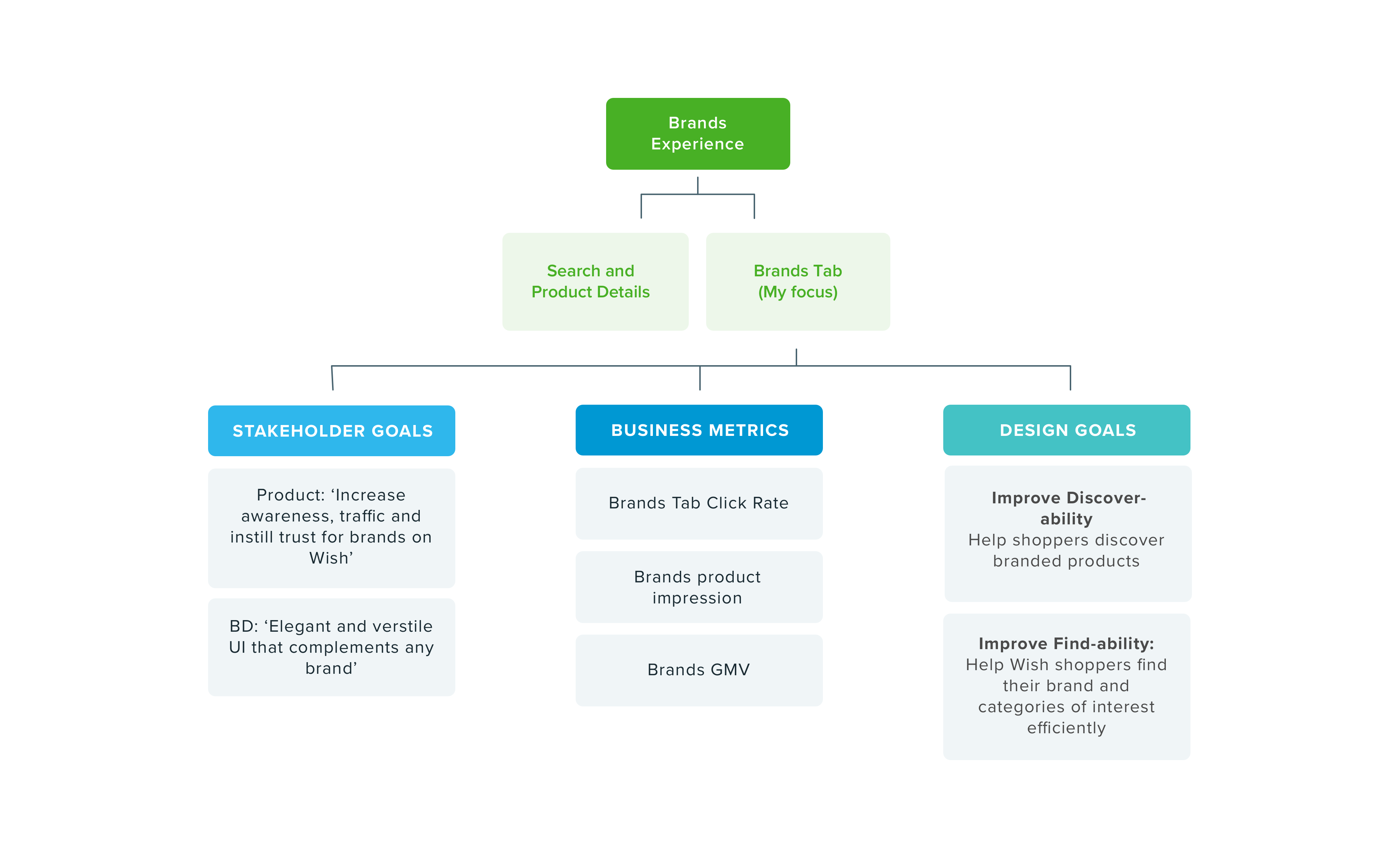
Based on the business and user goals, We identified our design goals for this project. Because this is a big project, we divided the it into two parts: I would focus on the Brands Tab experience, and the other designer focuses on the brand search + product details experience.
Foundational Research
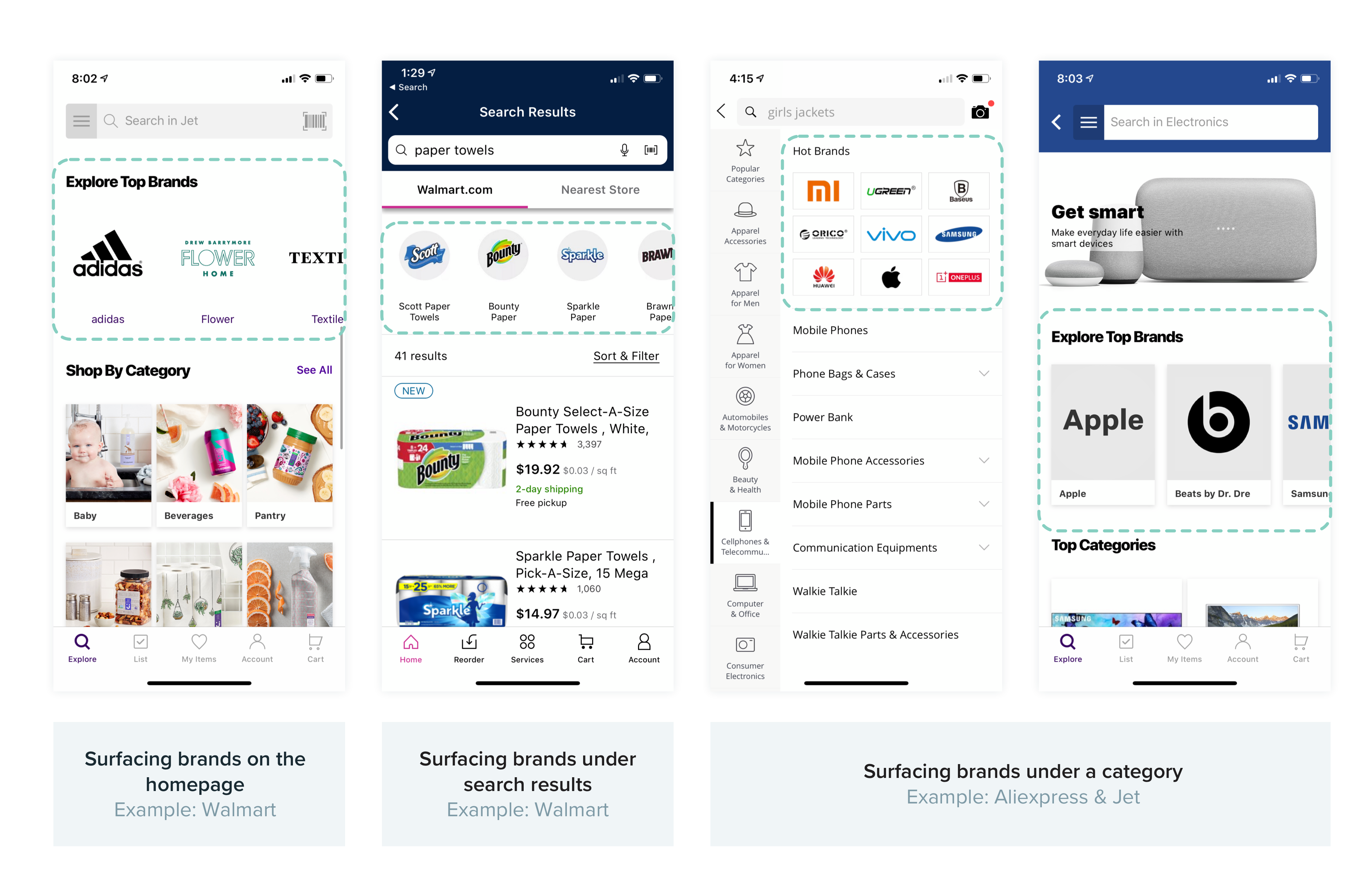
↑ Brand experience on Jet, Aliexpress and Walmart
I researched competitor apps that use brand navigation as a critical part of the shopping flow. There are three major practices: Surfacing brands on home page, surfacing hot brands under search results, or under specific categories. These findings acted as a baseline for my V1 explorations for the brands tab on Wish.
Design exploration V1
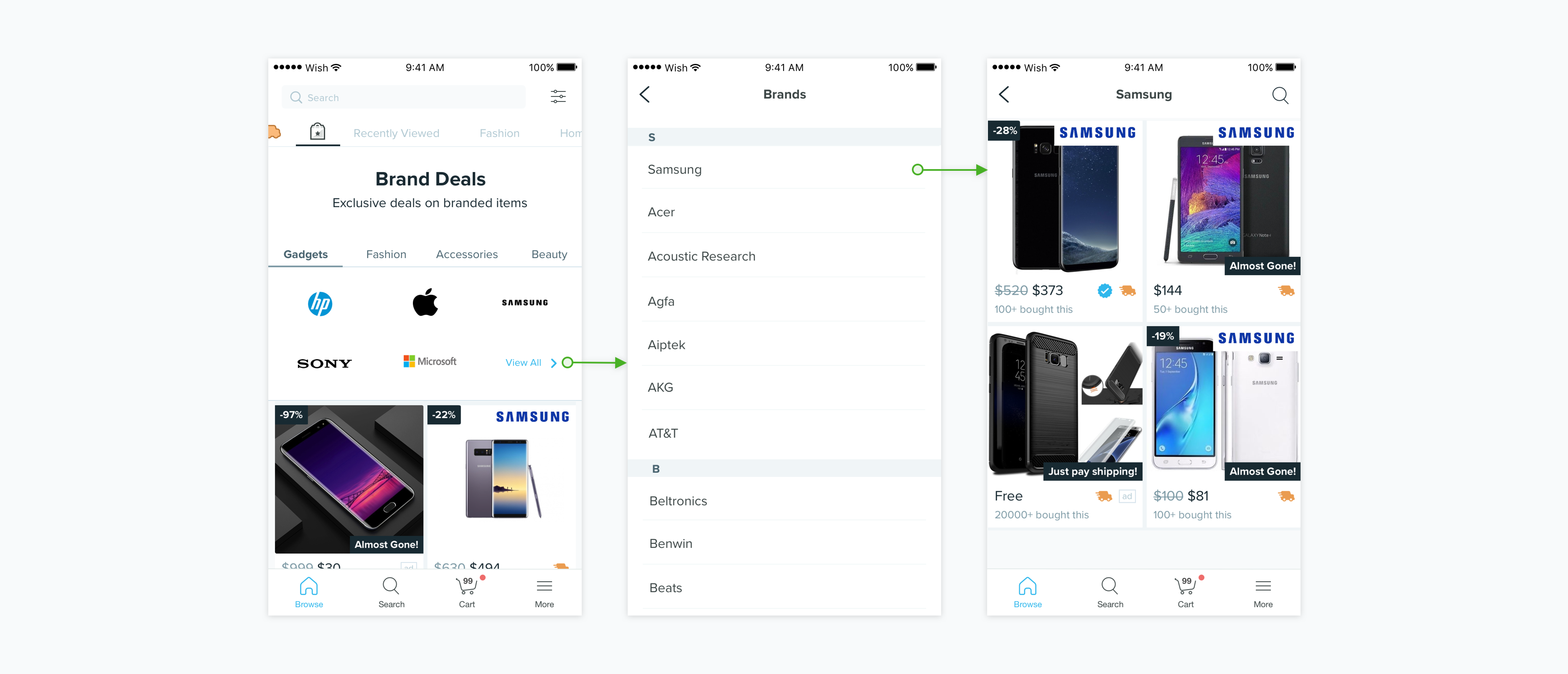
↑ Surface brands on brands tab
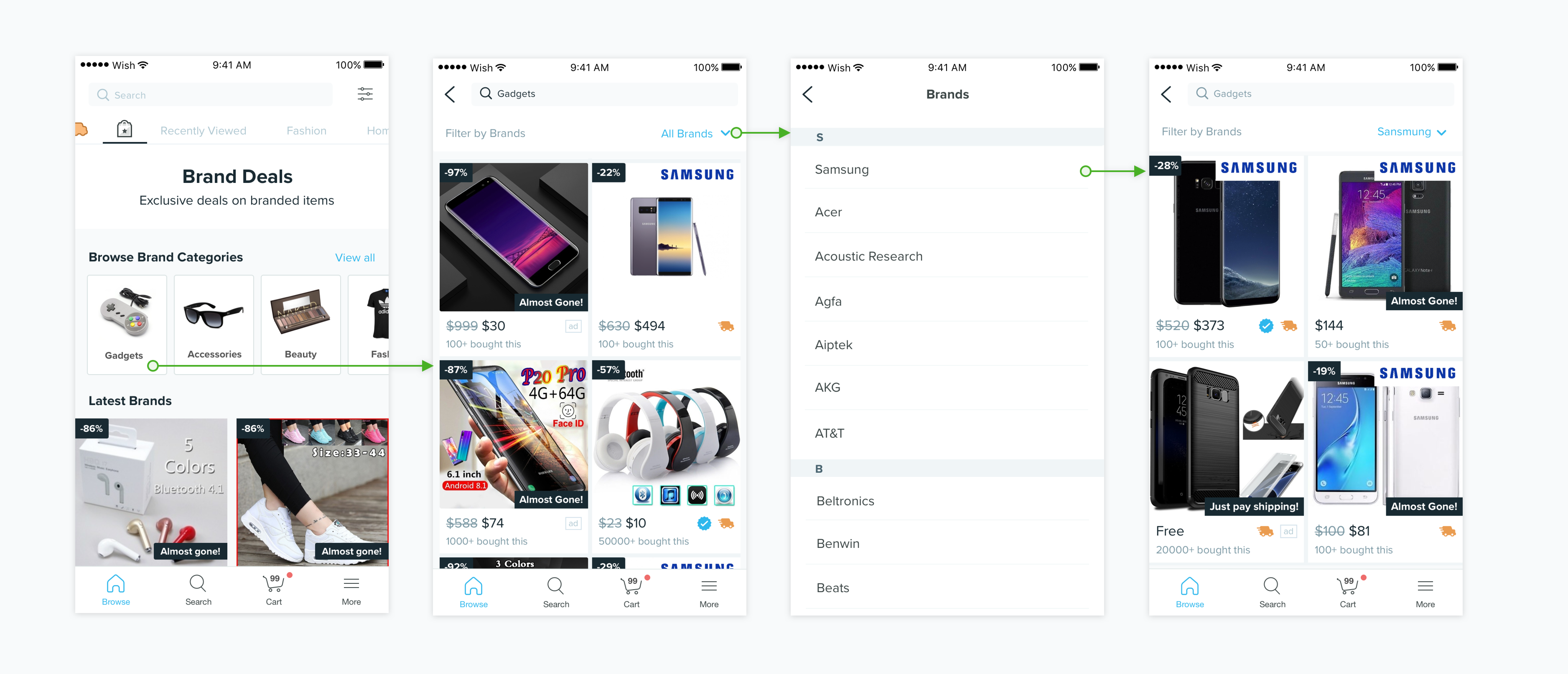
↑ Filter by brands under categories
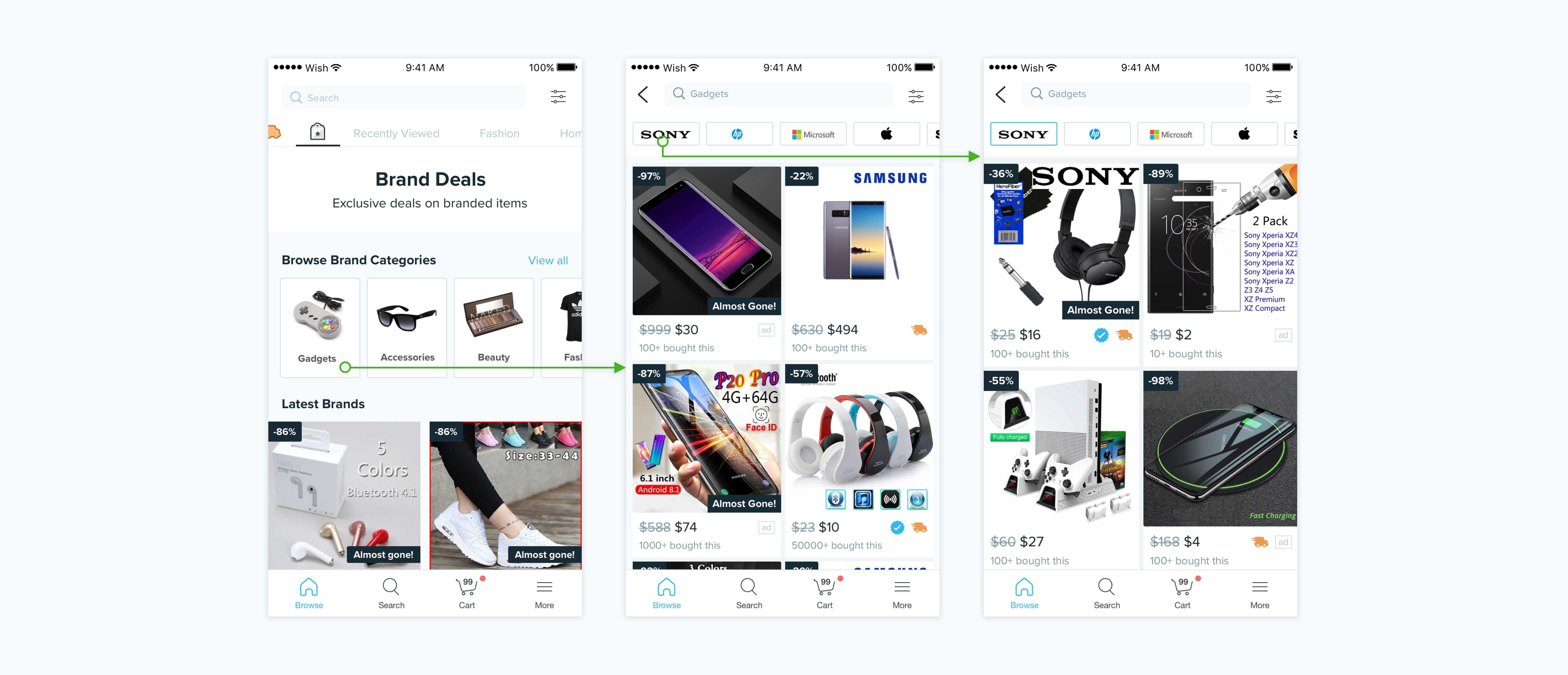
↑ Suggest top brands under categories
Converging & Iteration
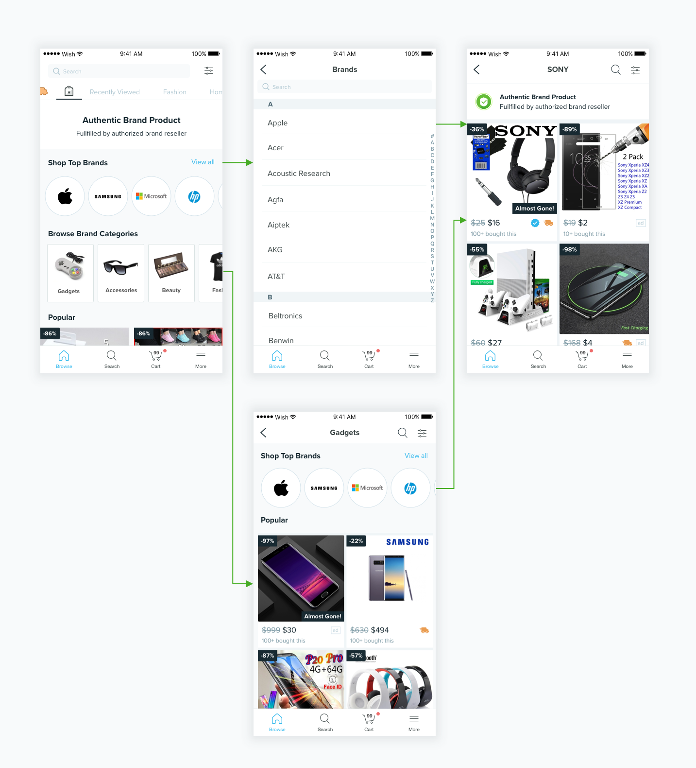
The first direction was well received by the stakeholders as it maximizes the presence of brands both on the tab and within each category. However, at the time we would have limited brand partners and inventory especially for certain categories, making the navigation experience less ideal. Based on the feedback, I came up with new version that surfaces the global top brands on the homepage independent of the categories, and provides a way for shoppers to shop by categories and filter by brands on each category page.
On each brand page, we also introduced an authentic badge and message on a banner to reassure shoppers that they are browsing products from a trusted merchant.
Sub project 1:
Brands Tab Icon Revamp
In the preliminary user testing, one of the surprising finding was that very few Wish shoppers understand what the brands tab icon means even as long time shoppers on the platform .
Q: What do you think this icon means? What do you expect to see after tapping on it?
P1: “Not sure, maybe where I can find some special deals”
P2: “There’s a star on the bag, so maybe saved items”
I did an iconographic study on the brand tab icon, to incorporate the authentic badge into the old shopping bag icon, hopefully to bridge the gap we identified.
However, before we experimented the new tab icon, we tried a quick experiment to replace the icon with the word “Brands”, which increased brand tab GMV dramatically. We think the reason is by using a straightforward name, more shoppers with the need to shop branded goods visited the tab. We thus decided to go with text on the tab instead of a redesigned icon.
↑ A picture is worth a thousand words? Not always true.
Sub Project 2:
Redefining categories
Unlike other shopping platforms, Wish users shop primarily through browsing the personalized feed. Others turn to search when they already know what they want. Only a small fraction of Wish shoppers use categories. However, brand products don't show up in the personalized feed, and we don't have an effective way for people to search for brand goods at the moment.
So how would navigating by categories help Wish shoppers on the brands tab?
Assumptions
Through user testing and discussion with the PM, I came up with the following assumptions:
1. Users navigate by categories when they want to get an understanding of the offerings when they are new to the app, and
2. When they don't know exactly what they want but have certain categories of interest.
Suggestions
Based on the user intentions and pain points, the new brands categories should:
1. Surface categories of high quality brand stock;
2. Surface categories with reasonable variety;
3. Show results under categories that correspond with the category name.
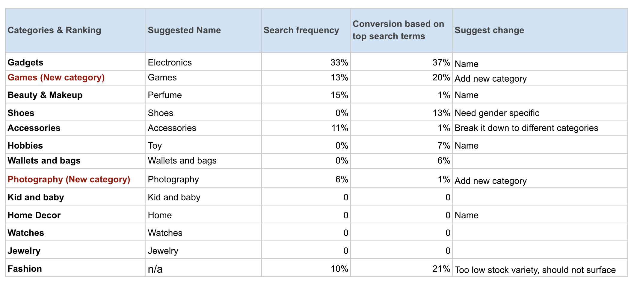
↑ Suggestions on Brand Categories
Through a brand search data deep dive, I was able to get a better understanding on Wish shopper's needs for new categories, and the relative importance of each category. Armed with the data and the guiding principles mentioned above, I made the following suggestions for a revised brand category list to the PM, the majority of which was adopted for the final implementation.
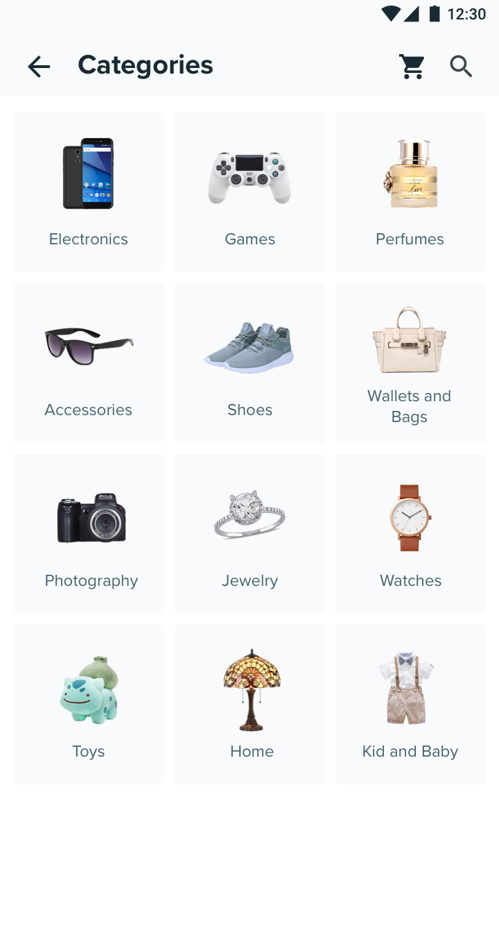
↑ New Brand Categories
Summative User Testing
We again showed the prototype to 7 Wish shoppers to get their reaction and feedback on the new design. The feedback are fairly positive:
All participants noticed the authentic badge on the brand tab and appreciated the meaning;
All preferred the new experience versus the current one. These keywords were used to describe the new experience: clarification, highlight brands, clean, straightforward, easy to understand.
Most participants didn’t shop brand items on Wish before, but when exploring the new design many went straight to shop by brands, and almost all mentioned they like being able to browse by brand.
We also learnt that many shoppers want to be able to further drill down to subcategories, and be able to see product names on the tile to help them identify brand items they want. We were not able to add those features in the first release due to technical constraint, but they are added to the future road map.
Final Design
View Full Prototype on Invision
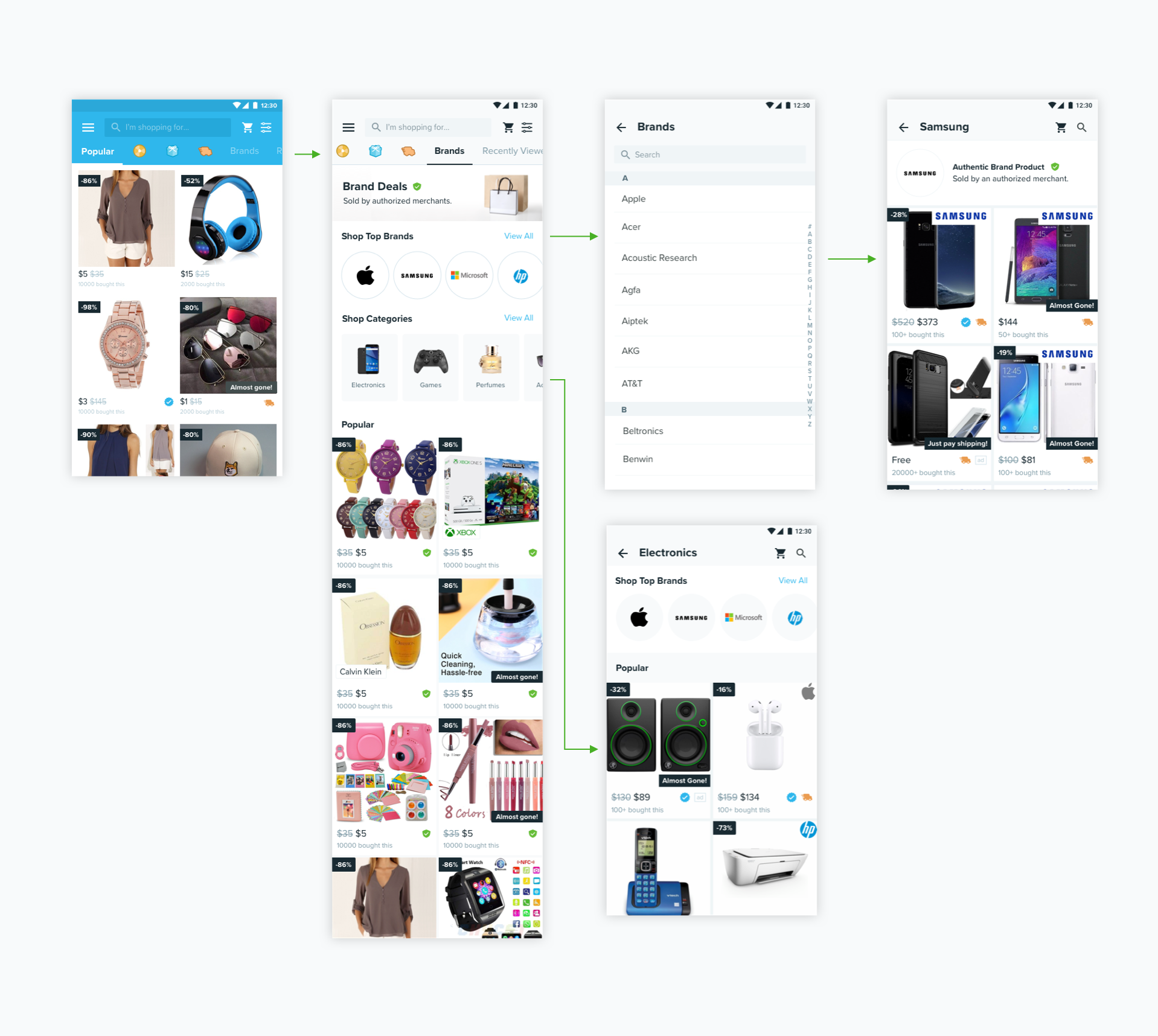
↑ Design Handoff on Android
Impact
The new design experiment was run on Android for 50% of users for two weeks.
"The New brand tab increases brand tab view to product click/add
to cart by about 10%, and gmv per buyer significantly. "
PM Update, July 2019
The data was consistent for the duration of the experiment, but due to small sample size the percentage increase was not not stat significant. However, with the trending positive result and the potential benefit to attract more partners, the team decided to ramp up the new design and port over to iOS and Web.
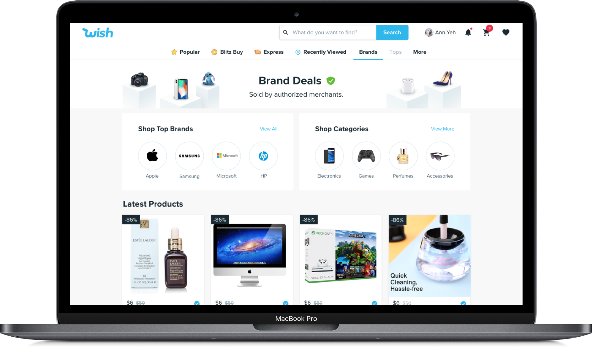
Porting Over to Web
Iterations

Final Handoff
View Full Prototype on Invision
Looking Forward
Now that we have an established brands experience, the team and I have started to look into further increasing the business impact of brands on Wish. Below are two of the initiatives.
Brands Stories
We experimented with Brands Stories on the homepage of the Wish app to increase visibility and awareness of brands on Wish. We followed a similar stories format as on other social media apps (which are also recently adopted by a variety of apps like Yelp and Google Map) to reduce friction of entry.
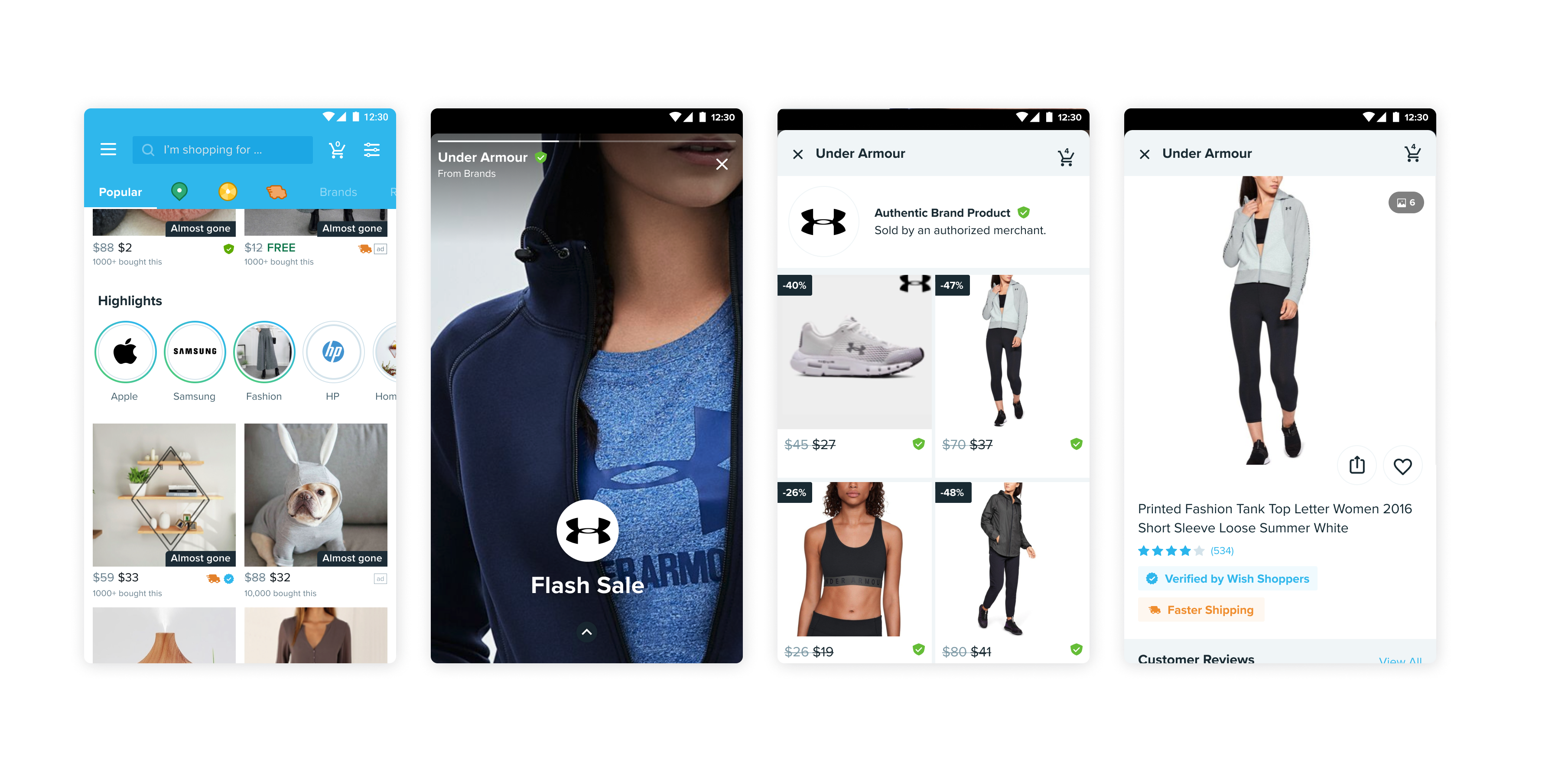
↑ Brands Stories with an entry point on the homepage
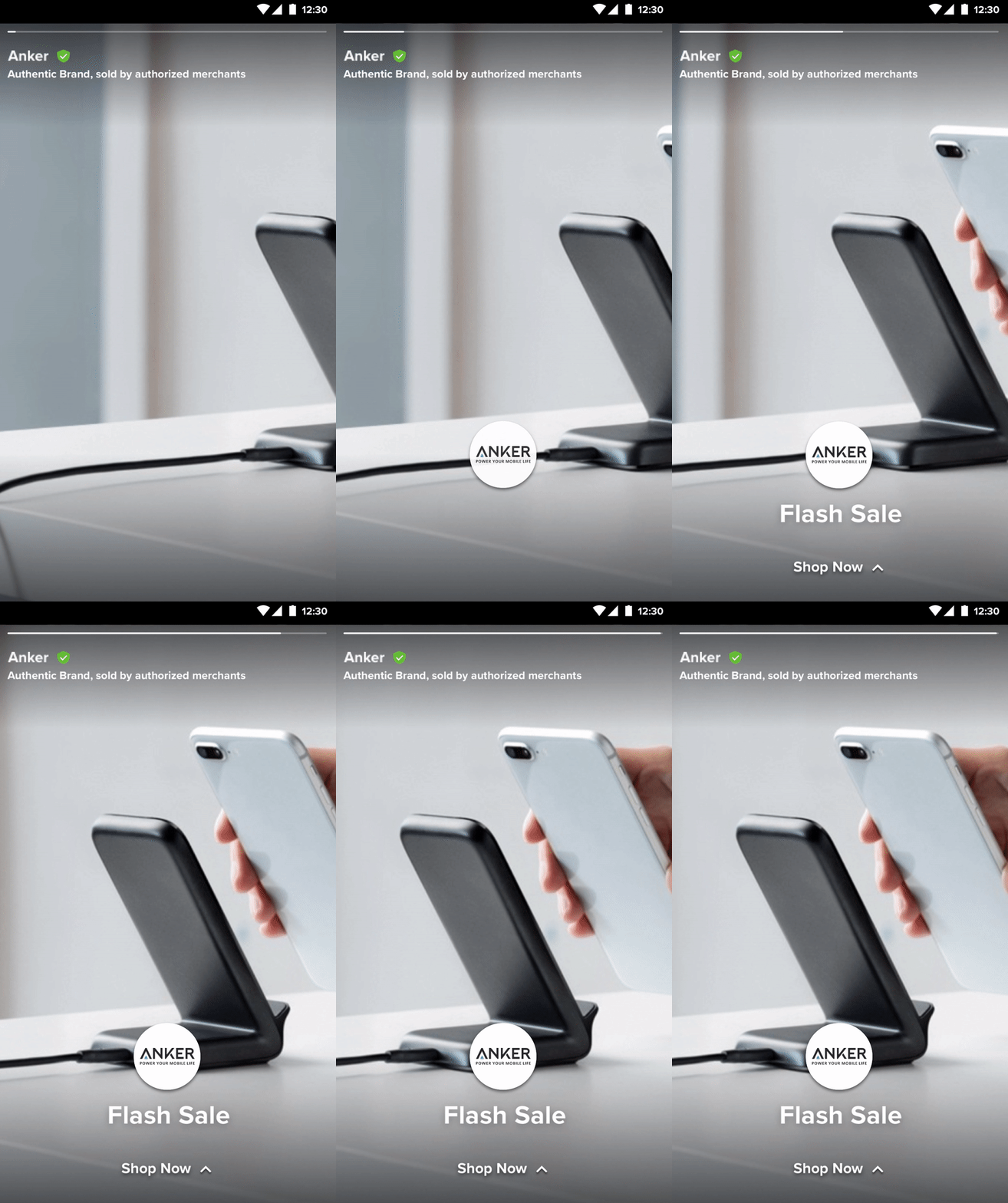
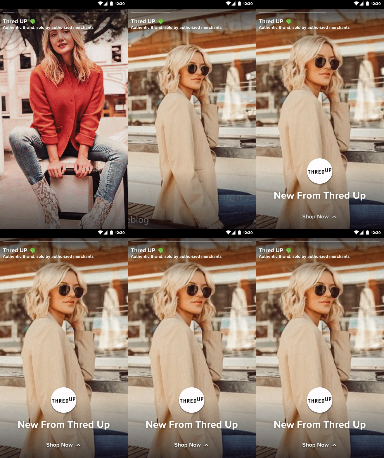
↑ Two examples for brands stories
As an MVP, we partnered with some of the popular brands to customize the stories for them. To make Brands Stories scalable, I created templates that could be reusable for all brands assets including static images and videos.
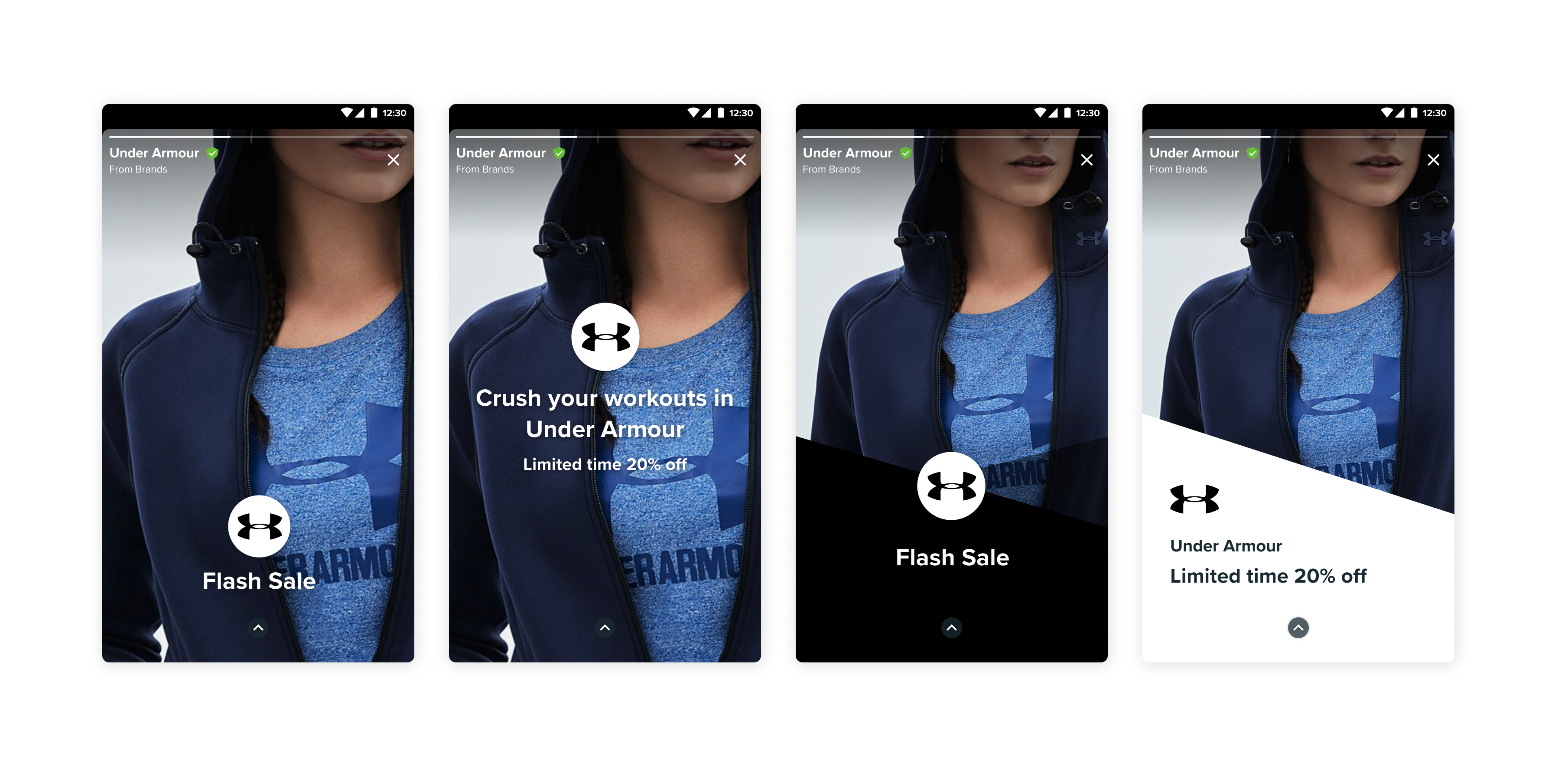
↑ Templates for brands stories
Brands Store Front
As most of our branded goods come from authorized third party sellers and there are usually many sellers for a given brand, the team wants to provide stores a customizable experience to distinguish from each other. This would also help users build trust with a specific store.
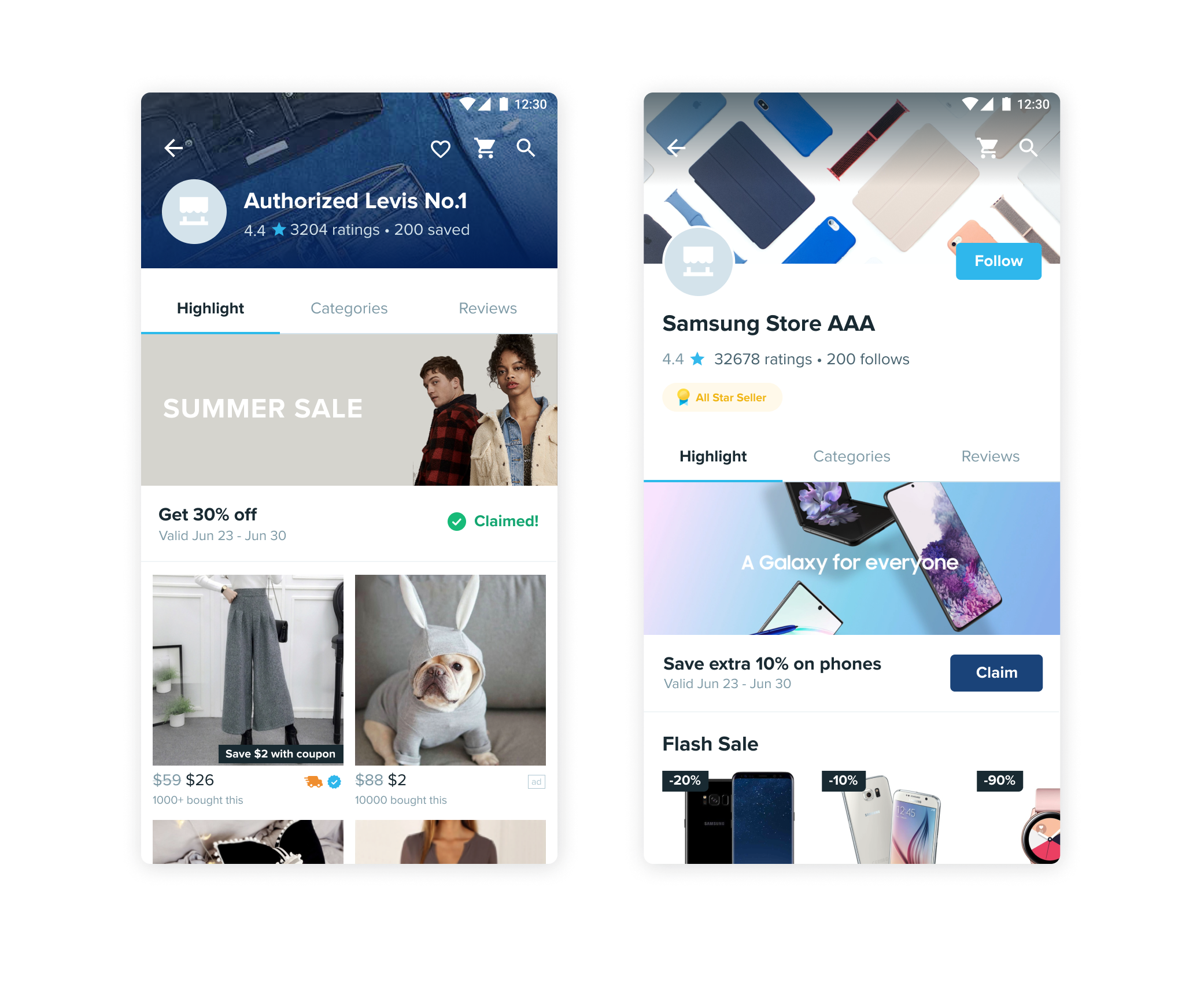
↑ Two design concepts for brand store fronts
Thank you for reading!
